One of the things I’ll do on the patreon is revist work and see if I can, using a minimal of editing tools push and pull it to improve the storytelling. There’s a surprising amount of improvements can be made by resizing things and finding a better balance of a composition.
Usually, I’ll try and do this before a thing sees print, but, of course, the nature of print means once it’s printed it’s done.
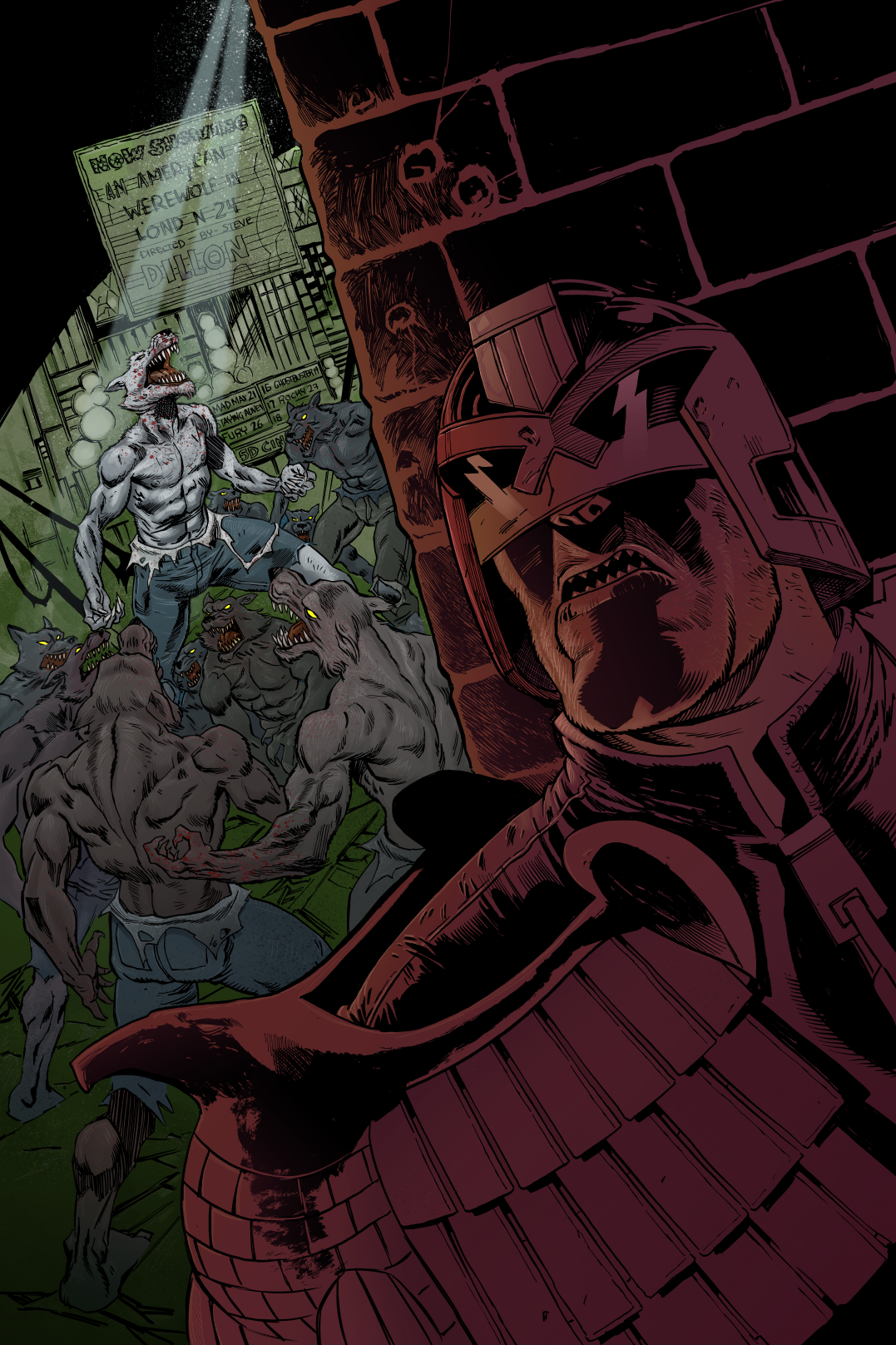
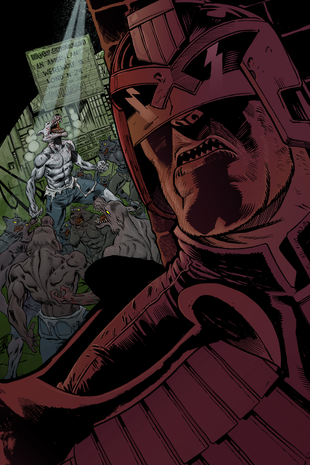
Here’s a reprise on the Dredd Wolf pic. The original and edit…


So, the only real difference is a punched up the size of Dredd. He’s bloody massive now, but the flat, dark red colouring keeps him recessed – he’s not as front and centre as a b&w image would be. He better frames the wolves behind him and we’re more engaged with what’s happening – we’re pulled much much closer to the action, and the threat feels more real.
Basically we’ve turbo injected the original idea.
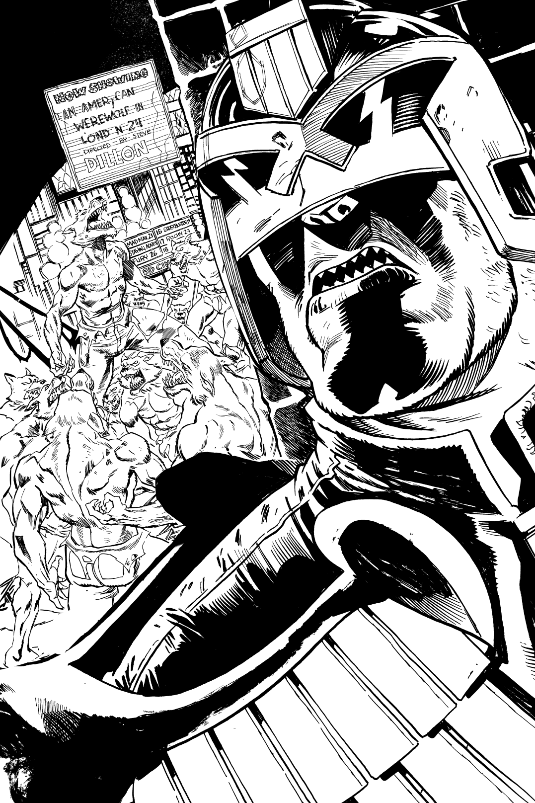
Not sure why I didn’t spot that easy of a fix, I suspect I was still thinking of it in B&W rather than colour. I’ve created a mock up of how the b&w might have looked, and it’s clear in b&w at least, your focus is drawn ENTIRELY to dredd. The wolves in the bg get a secondary glance. The big block of pure b&w draws your eye, and the many lines of the wolf merge to a grey in your vision.
Story telling is about figuring out where the focus needs to be for the image, and how to balance the various elements to tell that story. The b&w fails on that count, I think, but succeeds in the colour.
Something to file away for the next pin up I think.

