There are panels I lean on a lot, panel shapes, compositions, etc, and honestly, I’ll do them without thinking because they work for me, but I’m trying to rethink some of these choices and make more interesting (or at least, more thoughtful choices).
Take this panel:
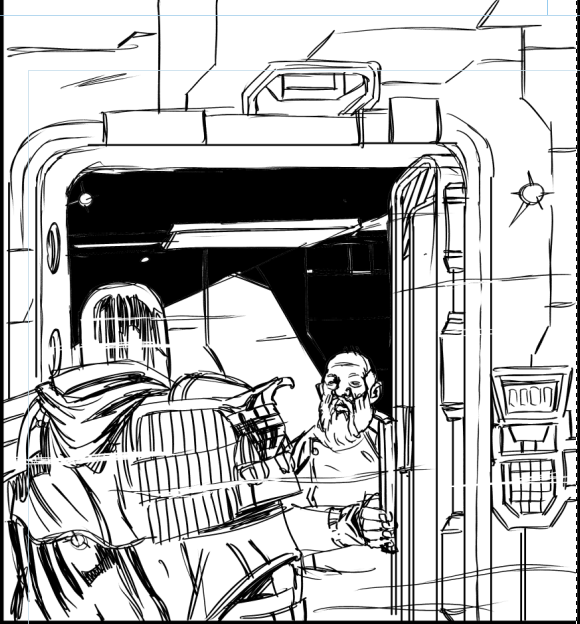
Absoloutly fine. Dredd gets to a door, door gets open. Not terribly interesting, but largely doesn’t need to be, this isn’t high drama. But the next panel, is an almost identical composition and so I needed to rethink it. Initially I went for this:
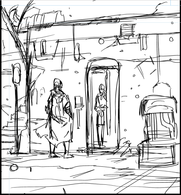
This is a bit better, I think. Pulled out more it’s an establishing shot, much easier to see we’re outside at a doorway. But still, that old habit of mine of keeping everything on an eye/just below eye level. What if we wanna move up higher (giving us a little more distance, a little more of the location?)
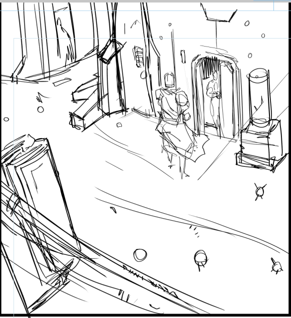
SO I think this is better from an angle, though the danger with panels at these angles is they feel voyeuristic, like you’re standing beside someone watching the proceedings, I mean if I added a window frame it would feel even creepier…
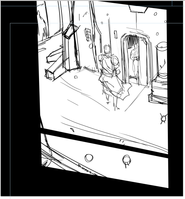
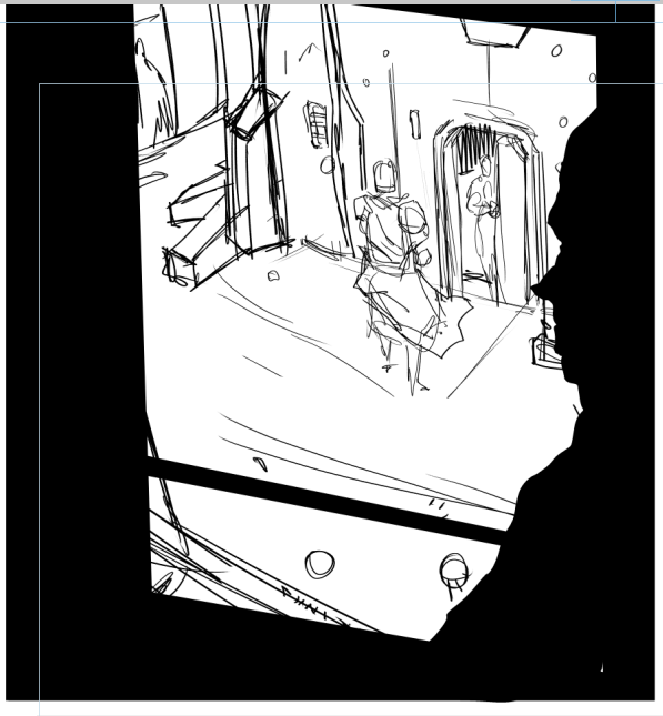
Anyway, that’s not what we’re after (I mean it COULD be, and if it was, it’d be great… but it’s not…)
Since a panel isn’t alone in it’s composition, it’s judged by what went before and what comes after, I check the previous panel and find – OF COURSE – I’d gone for an almost identical angle on the previous page (last panel) and this (the first panel on this page) feels a bit… like the time gap between them is immediate… I want it to feel like more time has elapsed, so a cheaty way of doing that is to flip the horizontal of the panel…
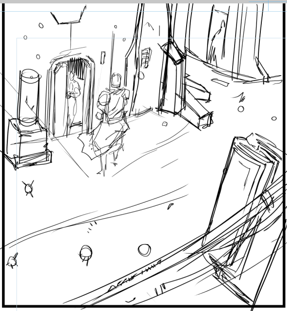
And in context, this flipped panel feels better (you’ll have to take my word) but I feel like I’ve lost a little of the atmosphere of that second attempt, so I’ll take another swipe at it…
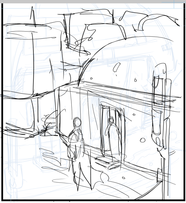
I think what I’m losing here is some sky, and at this angle (birds eye view) I’m not gonna get it, so time to go low… really really low…
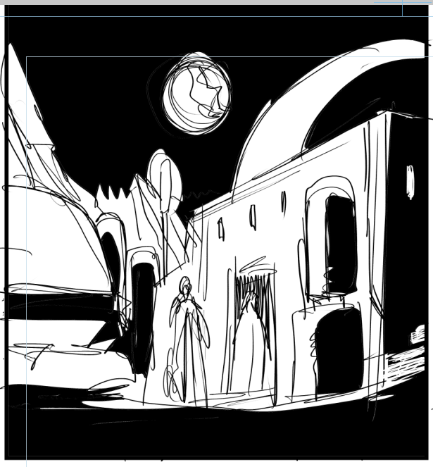
This has enough in it that I think this could be the one, so a quick refinement later and…
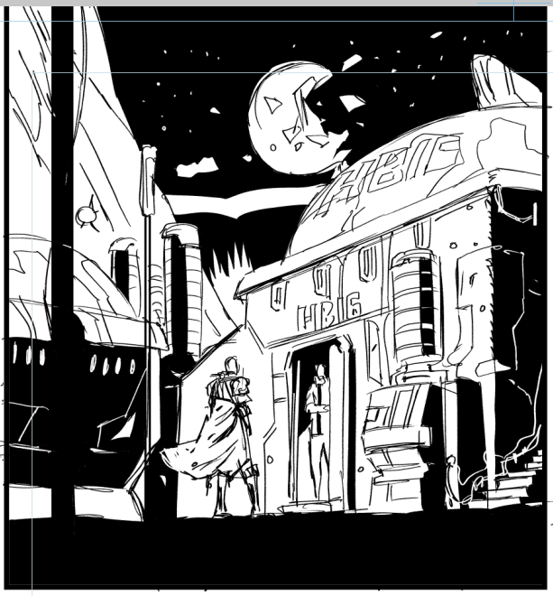
One thing that I’ve started thinking about on this new Dredd strip is… how much does this bit look like a scifi book cover (and how little does this look like something I’ve drawn before?) and this scores it on both counts. We’ve take a functional but dull panel (in my drawing of it, at least) and turned it into its own little sci-fi tale. Pleased with myself now, let the self loathing recommence in 10 … 9 …
