0 12290
 

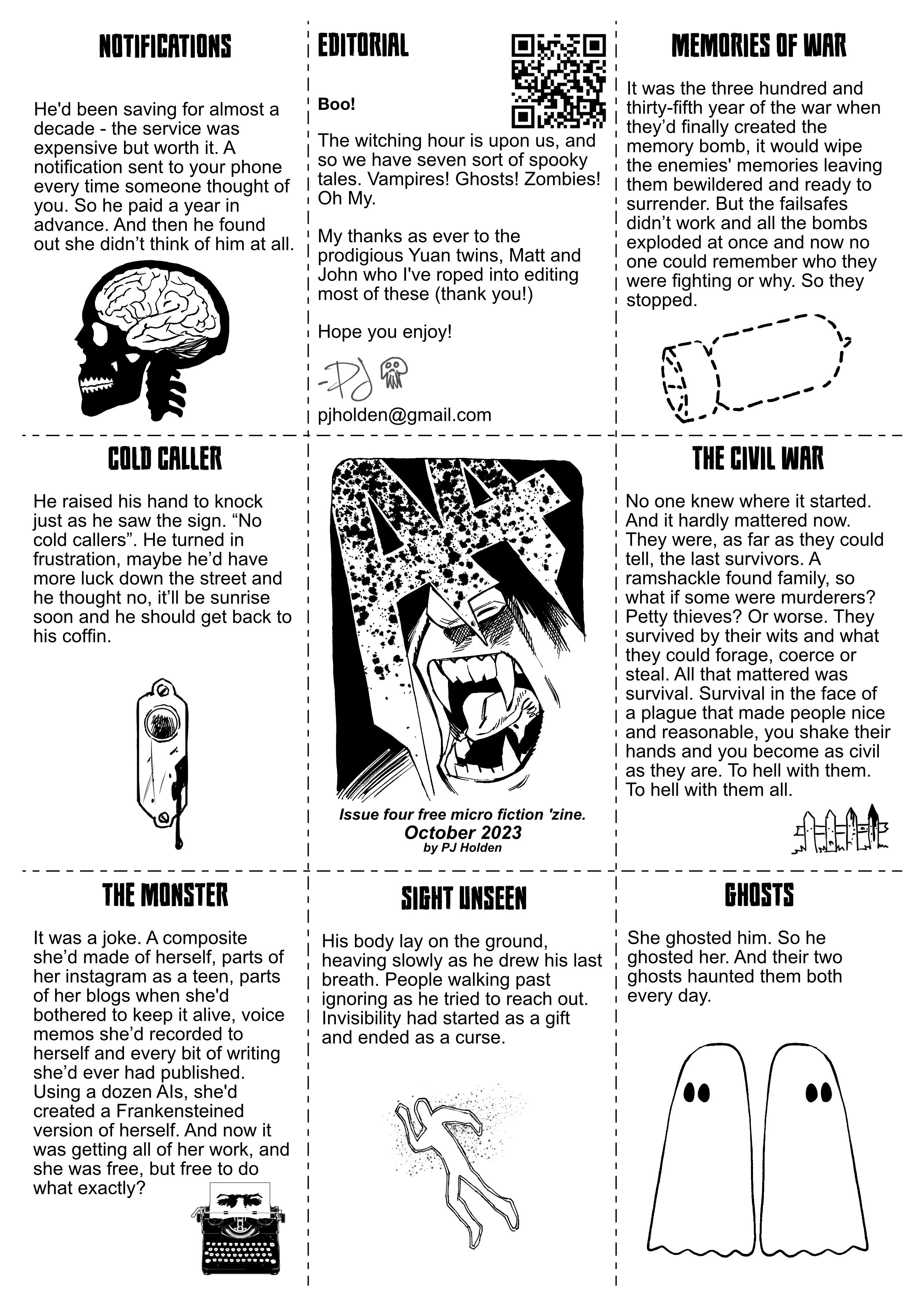
A4 Issue Four

If you prefer you can download the pdf here.

My unending gratitude to Matt and John Yuan (deputy publishers of 1First Comics) who volunteered way back on issue 1 to proofread (off the back of a plaintive twitter plea) and ending up both being great proofreaders and even better editors - constantly encouraging and giving little notes that never alter the fabric of the story but always help.

Stories this issue:

Notifications, Memories of War, Cold Caller, The Civil War, The Monster, Sign Unseen, Ghosts.

A4 Issue Four Notes!

Gah, two stories with War in the title. So annoying. Hadn't spotted it until now, but there it is. It will be my eternal shame.

There were two things drilled in to me from English lessons in secondary school (which I did rather enjoy, I loved writing, and was told to apply for O-Levels early, so I did, and then I didn't do any work because I was fundamentally lazy - so failed it) anyway, the two things: never use the word got/gotten (I think this was my teachers personal bugbear, with teenagers writing "I got given a book then got a clip round the there and got out of there, before he got me" even I'm uncomfortable seeing the word "got" in anything I write) and never repeat a word if you can help it (obvious "I", "and" and so on are all fine). So two wars. Not good. Am annoyed. (Should point out, this is entirely a quirk of my own making!)

From hereon in there will likely be spoilers!

I had planned on a halloween all horror special - or at least as best as I'm able, but of course, I couldn't quite come up with every single story as a horror, so let's start with the least horror like story:

Notifcations

I suppose this and Ghosts share a very common through line, rejection and knowing the person who rejected you never even thinks of you. For a full exploration of this idea, watch the amazing "The Eternal Sunshine of the Spotless Mind".

Memories of War

There's a lot going on in the world, and much of it can be traced back so far that you'll never find the beginning point (hello from Northern Ireland!) - and the question is, if everyone lost their memories would those wars still continue. (this story optimistically says we'd all stop, I have a horrible feeling we wouldn't)

Cold Caller

Phew! Lighter fair! Actually there's a different story that uses the same sort of idea (the no-hawkers caveat that many people have at their door) I've been sitting noodling as a short comic for a few years (how many? oh man, it's embarrassing to tell - but let's say I first thought of it pre-pandemic) it would be far too long to do as one of these stories, so this slightly different version of it popped in to my head.

I am pretty proud of that title though, it came late - after I'd written a bunch of the stories and I was thinking "gah, now i need a title" and ping! there it was!

I did want to do stuff that was just a smidge lighter than last issue, because I've been told some of this stuff is DARK. I think of it all in the abstract, words on paper rather than real monsters. But we're haunted by the real and the imaginary, I suppose.

The Civil War

I saw a writer (a good writer;   it'll be a good book) talking their new Zombie book and it got me thinking, that zombie stories tend to be the ultimate "yeah of course I was the assehole prepping for the end of the world, and look, I WAS RIGHT" and I thought "what if instead of it being zombies, it's that everyone was just really really nice to each other ... oh... those asseholes wouldn't change..."

The Monster

I'll be honest, andI bet readers can tell, I shoehorned frankenstien in too this (because I wanted monsters, dammit)

Here's my orginal story idea from the apple notes app:

He had fragmented himself, Pumping his entire written and audio corpus through AI Large Language Models, and created an army of bots, one for each of the balkanised social media platforms. And he was finally free. Free to get on with work.

Is it better? it might be.

Sight Unseen

This could be policitical satire, I suppose. In the hands of a better writer. Instead it's simply a piece of fiction.

Ghosts

Gotta be honest, I just loved the shape and sound of the story. I love that it works on a couple of levels.  It pretty much came out fully formed, and so short. Honestly this is the joy of these shorts, there's not an ounce of fat on the idea, there's no point trying to extend it, and there's a sort of poetic quality to it. Anyway, might be one of my favs.


Hope you enjoy it, I would love to know what you think - you can fire me off an email to pjholden at gmail dot com if you like!

Folklore Thursday: Island

After John Reppion and I did a fun little one pager using a tweet from John as my script for a one page comic we rattled around thinking what we could do next, and we’ve glommed on to #FolkloreThursday on twitter, folklore Thursday is every Thursday people talk about folklore. It’s pretty simple. So we decided to see if we could do this again, and John sent me a ‘script’

It looked like this:

 Many old stories tell of sailors landing on mysterious islands, out in the open sea. There they make their camp, and light their fires. Then the island sinks down fast. The drowned become its food. The island is not an island at all. It is the Zaratan – a monstrous sea turtle.

My basic work flow on this is to separate the paragraph into chunks (usually sentences, but sometimes I’ll break them up for the flow of the art and how I picture it in my head)

So this got broken up as follows (along with my thoughts)

” Many old stories tell of sailors landing on mysterious islands” – initially I thought I’d have to make this two bits, but couldn’t figure out a good way to break the sentence up.

“Out in the open sea” this felt like a panel on its own.

“There they make their camp, and light their fires” – single panel, can easily have a lit fire and make it look like a camp is being setup.

“Then the island sinks down fast” that was gonna be hard, showing a sinking island with speed, I ended up making it two panels. You want to show scale, but also speed. Hard to do.

“The drowned become its food.” “the island is not an island at all” “it is Zaratan – a monstrous sea turtle”

One of the rules I’ve sort of set for myself (and may well abandon) is I try and do minimal amount of damage to the words – keep them as they are as best as possible. But, and this may be the sholocky sensibilities in me, I don’t half want to change that last line to “the island is not an island at all. It is a monstrous sea Turtle” “THE ZARATAN!” (and maybe that will happen further down the line)

Here’s scribbled layout.

The final panel was going to be hard, because I wanted the monster and the eating and the way the words happen and the order they happen to reflected in the drawing. In the end the fix was simply to flip the turtle horizontally.

One thing that surprised me was just how cartoony this one was. I can’t deny I was influenced by Johnny Dubble’s amazing pirate art and the book How To Think When you Draw 2 (which has a great page or two on drawing pirate ships) so it could be they leaked out of me, but also, having just finished a fairly serious war story it felt good to let loose a little.

I chopped the sinking into two panels in the pencils, and drew the pirate ship in front of it, but when I inked it the ship was just in the way and it was never clear we were looking at the island sinking, so off it went to the big pirate bay in the sky.

Inking was done by hand, on a blue line print. Drawn at digest size. This is partly for speed – I want to do these quick (how quick? pencilled and inked yesterday, coloured last night and finished this morning, about four hours total?)

With the captions all added there was still something missing – that pirate ship on its own never made sense, it needed something to lead you in to it, and then I hit on the fun idea of having a single line of dialogue here “LAND HO!” to bring you in, and join panel one with panel two.

Strip all pencilled and inked traditionally, then touched up and letter in clip studio on my desktop, I then transferred it to my ipad to colour it in bed (best advantage of csp on the ipad, working while in bed in awesome – while others read, I’m colouring…)

And voila the finished beast!
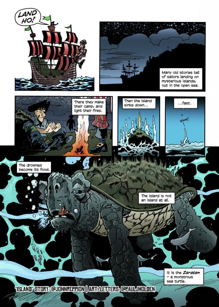
I’ve been asked a few times “will there be more” and I think “yes” but we’ll have to see. And, weirdly, by a few people “will these be collected” and the answer to that depends on how the answer to the first one goes.

I know this though, we’re not being paid to do this, so our only barometer of success is whether people like it or RT it on twitter, so if you’re keen to see more, that’s the way to do it! (and RT is worth about 100 likes, so keep that in mind!)

-pj

(Oh, and thanks to John, who rose to the occasion magnificently!)

Tweetdrawing

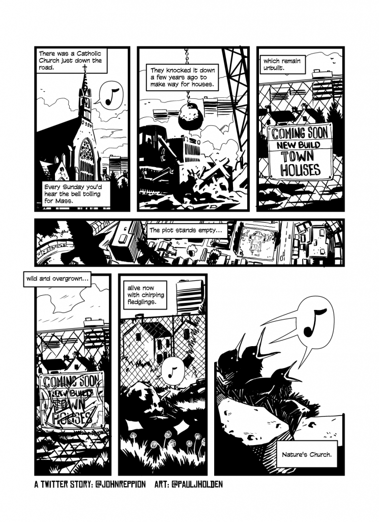
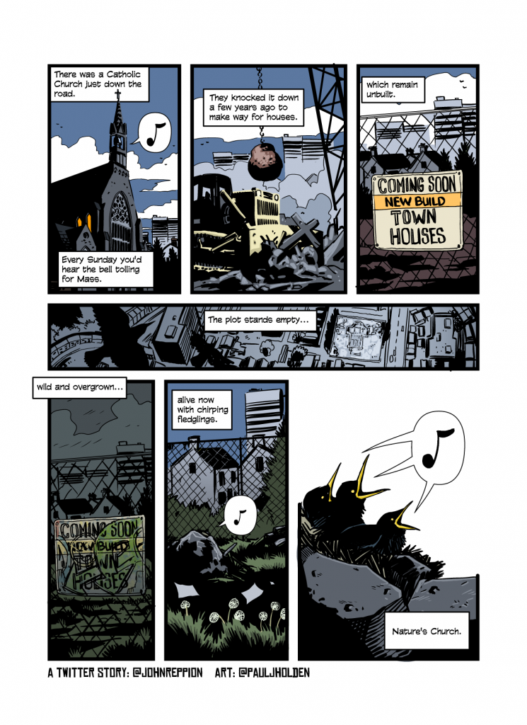
Earlier today, my friend John Reppion posted a little musing on twitter about a local Church being knocked down.

John is a great writer, and the tweet had a lyrical quality that I really responded to. So I thought, as I’m winding down to relax for a holiday (hahah) I’d do a quick drawing of it as I saw it.

Here’s the tweet:

Presented as an image to maintain the historical record!

And I quickly scribbled out a layout and chopped the words up as lettering (drawn in Clip Studio at the digest art size, so I couldn’t get too precious and fiddly)

Tweet as Comic

Took a minute or two. Sent it to John for his approval (I mean he was surprised to see it I’m sure, given it was just me faffing around).

Then I went off and did some paid work and came back to it.

Speed drawing is funny, the trick is to cheat as often and as much as you can.

Cheat one: don’t pencil. Just go straight from the roughs to inks.

Cheat two: photo reference. Just google the hell out of everything and trace it. Google a church. Google a wrecking ball. Google a digger. Using maps to get an overhead shot of some buildings so you can quickly use that to build out a panel. Copy a panel and draw over it. And finally google some birds.

Cheat three: TRACE EVERYTHING. Don’t grab photoreference so you can internalise what a digger looks like, grab photoreference so you can trace the digger. If you’ve any sort of eye at all you’ll introduce enough variety in what you’re doing that it won’t be a problem to describe it as a reinterpretation

Not gonna lie. There’s a lot of tracing in this.

Here’s the black and white:

Now for colour, I skipped the flatting/rendering stage and just stuck with simple colours – but I grabbed a page I liked by an colourist I liked which covered similar colours to what I knew I needed and sampled it for all the colours. That to is big fat cheat.

Channel Hex: Digest Size

I’ve been keen to thing of Channel Hex as digest sized, it makes sense, drawing roughly A4 art that’s half my regular art sized, should be much faster.

But then you start looking at what digest sized MEANS – and it turns out … there’s a few different digest sizes.

Here’s a small selection…

From left to right: Early british cowboy comics (though to be fair, this is probably an enlarged digest sized), Zombie World Champion of the Worms – great comic, but smaller than normal comics. Nathan Never – dark horse reprints, an italian digest size and commando comics, what I think of when I think about digest sized.

And that’s not the end of it, there’s lots more options. But looking at these books, it feels like the most flexible in terms of what storytelling I can do vs small size, it’s the Italian digest size that works best. So I had to do some numbers.

Now, ordinarily, I want to draw at least 40% larger than final art (and I may still do that) but measuring the italian fumetti sized comic, and multipling it by 40% puts it slightly larger than A4 – which will not do, I’m afraid.

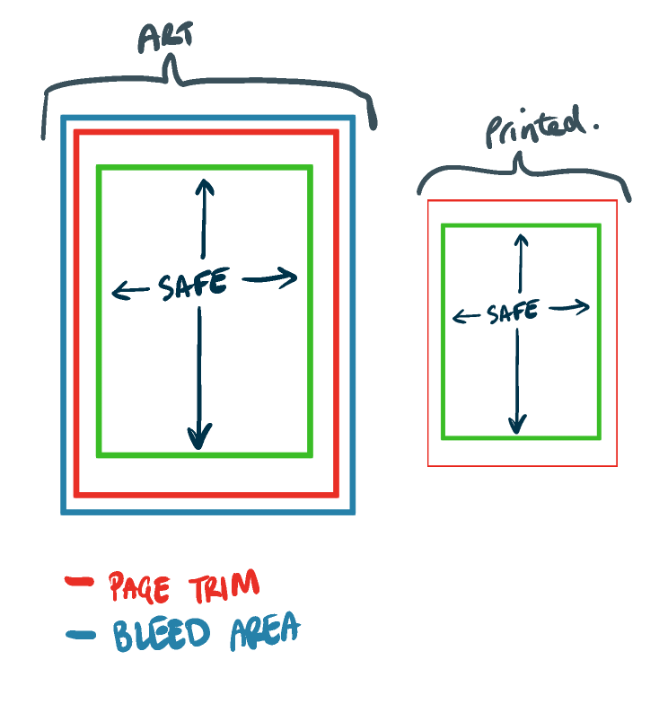
So I enlarged the page size to 30% instead, which JUST keeps it in to A4 (strictly speaking I added a 5mm bleed around the printed art, that’s probably too large, so it’s fine) and I get this:


Width Height 30% W 30% H A4 W In A4 H In
Safe13018016923420.531.5
Page Size1502101952737.512
Bleed16022020828615.5

Width = printed width, Height = Printed Height
30% W = Width * 130%, 30% H = Height * 130%
A4 W In = A4 Width In, A4 H In = A4 Height In.

Sizes here are MM, the A4 W(idth) IN and A4 H(eight) IN are my way of not needing printed blue lines, If I measure 20.5mm in from the left and then 20.5mm in from the right side of an A4 paper block then the distance between those two measurements is 130mm (ie the safe width)

It all looks a bit like this:

Anyway, that’s how I’ve been spending this evening. There’s a surprising amount of maths in comics. (Though, to be fair, only because I’m too stingy to blueline paper)

Course, now I’ve worked out all the sums involved, I can just create my own blueline in Clip Studio and use that from now on.

And, as a bonus, here’s the sizes for 2000AD Art Size Paper:

Page Size: 30.2cm x 39.43cm (this is bigger than A3 so you’ll either need to use bigger paper trimmed, or, do as I do, draw to the edge, scan it in and then draw a little extra on the page in photoshop)

Panel Size (or the Safe Area, in other words – that area of the page that lettering will go into) 26.44cm x 35.79 cm

TRIM Size – if you want to full bleed the art the art needs to be drawn to the page size, but, between the page size and the trim size the art may get chopped for trim. 29.37cm x 38.59cm (Just ignore this, if you want to have art bleed off the page then draw ALL the way to the Page Size)


Channel Hex: Planet of the Blind

Reminder: this isn’t the final work, the final work will be an entirely different story. This is just me trying to figure out some stuff about logos/layouts/page sizes/etc.

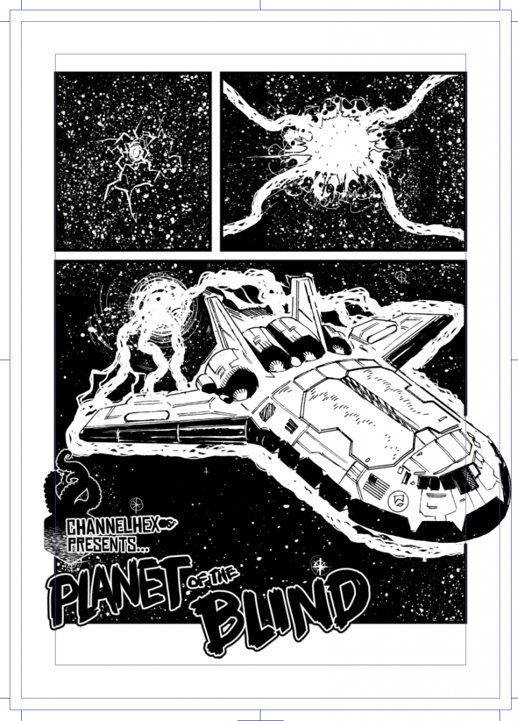
Anyway, last time on Channel Hex, I’d planned on a commando digest size and now I’m skewing more towards a slightly larger italian digets sized – art would still be A4, but those books tend more towards 4-5 panels per page rather than 2 (ultimately it may be between 3-4) so I drew a page of the imaginary story (aren’t they all) of Planet of the Blind, and dumped some logos on there. Thanks to my pal, Jim Lavery – who put up with me doggedly asking him to help me design a logo even though I’d clearly had exactly what I wanted in mind already – who suggested a font choice that works great. So I mocked up a single page of the comic, and here it is:

There’s a little too many logos on that page, I don’t think the smaller hex-tentacle logo works at all, and maybe, on that first page i don’t need the logos at all (though the temptation to use the hexagram as a 2000ad style credits in the strip is almost overpowering.)

I’ve a colourist friend has promised to colour up the cover, so once that’s done I’ll repost it with logos/etc.

I’m keeping the actual story under wraps – it’s a corker, and exactly the sort of thing I’d enjoy, fingers crossed when the kickstarter happens (and I’m working at timing now, a tricker thing that you’d think) then you’ll hear all about it on my mailing list at Channel Hex.

Channel Hex: Planet of the Blind

Got some work done, decided to start playing with logos and layouts for the kickstarter digest idea.

(To recap: a 64 digest comic, it’s actually 68 pages – once you include the covers, drawn while I do other work. Scifi/horror like the old UK Starblazer imprint)

So, in order to start working out layouts for a cover I needed a cover. And I didn’t have one. So I figured, it was time to test my working hypothesis that I could draw an A5 sized comic at A5 sized (which is about a quarter of the size of a traditional comic).

Man, my eyes are not what they once where, it was a little too tiny. So I might scale up – maybe not all the way to A5, but a decent 40% larger, maybe… (So a single page will fit on an A4 page, but it’ll still be smaller than A4)

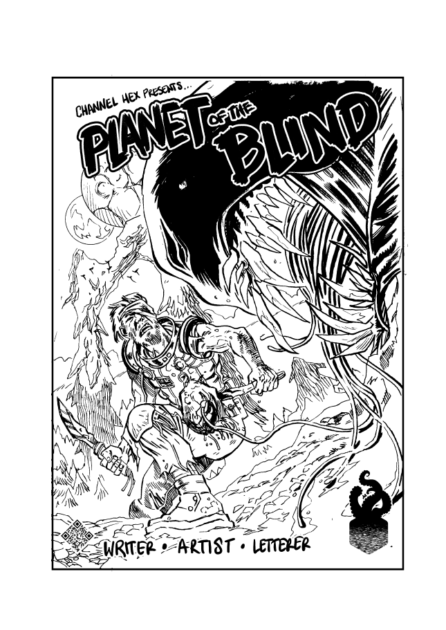
This cover was a lot of fun to conceptualise and draw. I knew I wanted a sci-fi old school concept, spaceman, fighting monster on new planet. Then I covered his eye with an eyepatch and decided to make the monster blind (and he’s hunting it with some rotten meat).

And then a title just came – Kingdom of the Blind – wasn’t quite on-the-nose enough – good old pulpy sci required it be called Planet of the Blind (he also requires his surname to be King, if I ever wrote it)

Anyway, here’s the cover…

The logo in the bottom right is the Channel Hex logo. Spent some time figuring that out today, tried dozens of variations and ended up … going back to the original logo I designed when I first wanted to do some short channel hex stories a few years ago.

I’m gonna stew over some of these design choices, but it’s been fun doing this. I’ve a promise of a script from a colleague I’ve done loads with in the past, and he’s one of my favourite writers too – so I’m really looking forward to it starting. Gonna be trying “marvel style” (it’s alright for me to go – I’M DOING THIS FOR FREE! but it’s a bit out of order to say “YOU MUST WRITE A FULL SCRIPT FOR ME”)

If you’re interested in where this is all going, definitely sign up for my mailing list – I’ve not sent any posts out in a while, but it’s a sure fire way to know when the kickstart is kicking off. Still lots of research to do on that front, I wanna make sure I’m going in to it with my eyes opened as wide as possible -I’ve had a couple of great chats with people and one of the big things, especially as first kickstarter is KEEP IT SIMPLE – one digital book, one paperback and one hardback and that’s it. Try and keep the posting options tight, so you don’t accidentally push yourself over the edge promising stuff.

Pomodoro

I blogged about this a few years ago, but it’s been years and my blog has been wiped, so off we go..

The pomodoro technique is a way of breaking down tasks and just getting stuff done.

It’s pretty straight forward for a comic artist, primarily because comics is mostly one second never ending task of drawing (for me). Page after endless page.

Here’s how it works:

You set a timer (a pomodoro timer, a simple kitchen clock will do, but there are apps), for 25 minutes – and you just sit and do a single task in that 25 minute chunk.

At the end of that, you take a five minute break – go have some tea, check twitter, doodle something else, whatever.

Then 25 minutes of a drawing, 5 minute break and you repeat that until you’ve done 4 chunks of a task, and then you can have a 25 minute break.

And then repeat.

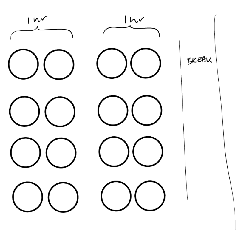
I’ve drawn a neat little diagram on a white board to motivate doing the damn things and it looks like this:

Now it’s rare I get to fill that whole thing in, but I find if I do it, I can get a page inked in about 4/5 of those pomodoro slots, and I know I get work down in as little as 25 minutes – if I can ensure I have a 30 minute uninterrupted period I can make progress and it all adds up quickly.

Where it fails for me is when I goof off, or start taking breaks and then it’s a failing in me rather than it.

Anyway, highly recommend you give it a go -at the moment, owing to various family commitments I’ve been unable to really find the time to work, but breaking it job in to 25 minute chunks has brought some semblance of order back to what I do.

Tiers of a Starblazer

So been thinking some more on the idea of a digest style comic on kickstarter and what sort of tiers I could do, and again, very open to ideas/thoughts on this. It’s not the sort of thing I want to leap in to without thinking about a great deal first.

There’s a lot to be said for the idea of one single price for one single product (Keep it Simple, Stupid) but then there’s a few fun things you can do on a kickstarter, so here’s some notions – not final ideas, not final prices, just … starting points…

There’s (obviously) a digital comic tier – £1 – a pdf download.
At some point, any comic like this I’d want to look at getting on comixology, but probably for something like £2.50

A Softback Print comic – I’d like to charge £5-£10 for a softback. Not sure how practical that is, but it’s something I’d be comfortable paying for a comic.

A Hardback Print comic – probably around £10-£15

A Portfolio edition – hardback plus a set of prints, from some other industry pros (maybe?)- in a nice little envelope? £ 35 – 50 – 100? (Depending on who I get to rope in and whether I want to make this really limited?)

Broadly speaking I think you’d divide original art into three levels: full page (A), title character page (B), other page (C)

Original Art – one hardback plus a page of C art – £35

Original Art – one hardback plus a page of B art – £50

Original Art – one hardback plus a page of A art – £100

(Again, KISS though – maybe just one Original Art tier at £50 to cover any random page?)

And I think that’s it. All copies signed, obviously. I’ve seen other artists offer sketches or other things to be done, but I think that really skews the amount of work required -and I’d like the book completed before kickstarting (so the idea of adding people if they pay to be in it is a bit .. not for me) I’d like to do the book and then fund the printing and and creation of it. What I don’t want to do is become obliged to do more work (I mean, there will be more work – signing them all and sorting them and posting…)

Another thing I think you need to consider with kickstarter are stretch goals – but I’ll think about that another day…

Starblazer

Starblazer was a UK Digest sized that ran (according to wikipedia) from 1979 to 1991, though not sure how they were distributed in Northern Ireland as I’m pretty sure I never saw one.

The digest size is a lovely format, I’ve been obsessed with for ages. Identical to the Commando comic (at least in terms of format) it’s  7 × 5½ inch size with 68 pages of comics. The physical size necessitates that the pages usually have an average of about 2 panels per page.

Printed on newsprint, with a glossy cover, I’ve been in love with the format since I first picked up a commando comic when I was a kid.

Where Commando specialised in war stories, Starblazer did sci fi tales.

There’s a number of things I like about the format, for one – it’s very drawable. You could draw a full page digest format sized page in an hour and a half, I think – pencils and inks. That makes producing one page a day very easy – functionally a single page is equivalent of about a quarter of a normal comic page.

What that means is you could easily draw a commando strip, a page a day on top of regular work load. (and if that’s a struggle, half a page a day, goodness, it’s so small you could draw it while you’re eating lunch).

One of the big problems with kickstarter for comics is that it’s pretty hard to get a kickstarter amount to fund the creation of a comic – John Reppion did the legwork here, and working out roughly £250 per page to make a comic (writing, pencilling, inking, colouring, lettering – all at a modest rate) you’re talking about 24 pages x £250 = £6,000.

That’s before you get in to printing the damn thing.

Let’s say you expect to sell 100 copies, and the print cost for 100 copies is £155*, and let’s call postage a simple flat £1 per issue, that’s another £100. So altogether you’re looking for £6255 – which breaks down at COST price of £ 62.55 per copy.

Which is clearly nuts.

Let’s multiple the print copies by 10 – selling 1000 = print cost £488, postage stays £1 per issue for £1000, total production cost is £7488 making each issue cost £7.48

Which basically makes the whole thing a non starter if you’re paying your team.

Now, the biggest cost is obviously script/art/lettering, but let’s say you do that yourself – while working on other things – the cost isn’t zero but you can bury the production costs into the general milieu of your day, doing a digest sized comic means you can really do a page a day (I find getting a finished page a day really helps with motivation) but you need a bigger page count, 64 pages or so …

Sums again – production of comic cost: zero.

Print cost (based on A5 print, 64 b&w pages + four pages colour cover/inside cover, for a print run of 100) £136

Postage £1 that gives a total print run cost of £236, or £2.36 per issue. Now if you can sell this at a £5 per issue on a kickstart (it’s a bit high, but it means you actually get to make a tiny profit) then bingo! You’ve made an amazing £234.

It’s not gonna make you rich, that’s for sure…

If you can scale up to 1000, you can go with : Print £581+£1000(postage) – £1581 / 1000 = £ 1.51 per issue cost, profits £3489

Which, actually, if you can then keep the momentum going and get yourself in some kind of flow, if you could manage to have a number of those little digest books coming out on a semi regular basis, say once per quarter, that’s a fairly respectable income for a project that really is just a fun little sideline.

(And if you can get some sort of momentum going and do something like that once per quarter, no reason you couldn’t do a horror, a comedy, a scifi, a romance and kids comic and more…)

And now for some Caveats:

Man, I think my postage and packing cost is way off … £1? That’s just me rounding to a nice number, probably something stupid like £2.35 or some other random, but high number)

The comparison wasn’t entirely fair, the £6k figure for a 22 page comic was assuming colours, where I’m talking b&w.

Also, I can only consider (*And I’m not really considering it, more doing some thinking-out-blog) doing this because I’m a reasonably accomplished artist who knows he can draw 64 pages and I’m comfortable lettering my work and doing a lot of the technically fiddly stuff, and while I’d probably want to write my own work, I’m sure I can put my hand up and look for someone willing to cowrite one of these little things with me, just to have something fun in print.

God it would be so cool though, right?

*This is cheaper than I expected, and just based on a quick google search and using this pricing website https://mixam.co.uk/comicbooks

Why Not!? Post Launch…

So, couple of days ago I put Tom’s comic Why Not!? online. I figured I’d put it up as a free pdf download, and if anyone wanted to donate something, that’d be awesome – Tom could have a little extra friday treat money (which is what we call pay day round here…)

(he’d prefer it if you called him Thomas, he lets me call him Tom…)

I told Tom about it and, when I picked him up from school, we had a whole £6 in paypal. This was great, as he’d already blown his friday treat money on Thursday as it was the European elections and Tom’s school was closed so we had to entertain ourselves.

He was pretty excited about how he’d spend his money.

By the time we got to the toy shop (a 2 minute drive) it was up to £8, and Tom was giddy with delight. He started looking around for what he could buy. I offered him a couple of quid to bring him up to something around a tenner if he needed it.

My phone dinged a few times and suddenly we had £16, so he decided he’d buy an xbox game (he doesn’t have an xbox, but he is getting one for his birthday on the 6th of June when he’ll be 11).

He picked up a game (for £15) and we went to pay for it – turned out it needed the microsoft gaming network thing which we didn’t think he’d be getting, so he put it away and got a different game for a fiver. Never mind, Tommy, you’ve got an extra £10 so you can spend that later. No, wait, it’s £24. Hang on, it’s £30, it’s £50, It’s £70, it’s £80, oh blimey, it’s £100.

Right now, he’s sitting on £220 and I don’t think he’s been able to process it! At one point I was getting enough little notifications Tom was just “why!? why are people giving me money, surely they have better things to do with it??” It was a really fun day for both of us.

Tom’s never been great with money (well, he’s 10, so every penny suddenly gets spent) but this big chunk of cash he’s decided to save – at least until his birthday – when he can blow it all on some cool xbox games (though we’re off to disney land paris soon so I’ve suggested he can save it for that).

We’re both super appreciative of everyone who’s donated, especially those who donated a silly amount (we’d worked out £2.40 was a reasonable amount since it’s the same price as the beano) and lots of people paid way more than that!

But one thing Tom has really really enjoyed is all of the comments, and he’s made me read them all out to him, multiple times. So thank you for those.

Tom’s surprisingly shy. He really doesn’t want to show his comic off to people he knows (I think his older brother, who has a habit of browbeating you is to blame for this a little) but this I think has really helped him.

He was already working on issue 2 before we’d put issue 1 online (and he’d written a very sweet intro where he talks about hoping people liked issue 1 -they did, Tom, they did) and we’re a few pages in to it.

I’ve told him to readjust his expectations of issue 2s sales, no way can we match issue 1 for income.

But I’ve also told him let’s try and make it better, let’s add more backgrounds, let’s make some stories a little longer, let’s see what we can do.

I’d like to say all the money has really encouraged him, but like most poor doomed artists he’d be doing this even if he’d only made £5 on it and if you don’t believe me, here’s a Tumbler blog I made when he was three years old and was writing stories literally before he could write – he’d dictate the text to me and I’d write it down (the blog only talks about a few of them, in the end he made maybe twenty or thirty of these crazy little books).

Anyway thank you for everyone who downloaded it, paid for it and left a comment. It means a great deal.

Here’s tom hard at work on issue 2!

Image

Why Not?!

Thomas(10) has been writing up and drawing up a storm. He’s written and pencilled a 24 page comic called Why Not?! – which is largely inspired by the Beano and the Phoenix.

One of the struggles of being a professional comic artist dad is knowing just how much help is too much help. When Nathan (now 14) was younger he used to stop drawing and just say “You do it, you’re better than me” – now I’m not sure if he’d say they same about any adult, but I can’t help feeling I was to blame on this one.

With Tom as much as possible I’ve tried to encourage but not overwhelm, but I think we’ve made a happy compromise. Essentially, I’m inking and lettering his comic. (Actually, I think I’ve got a raw deal).

Now, in his defence, he did offer to pay me. 50p. I refused, and he upped it to £2. (I didn’t take it, but there was no back end deal, so again, I’m feeling like I’ve been taken advantage of)

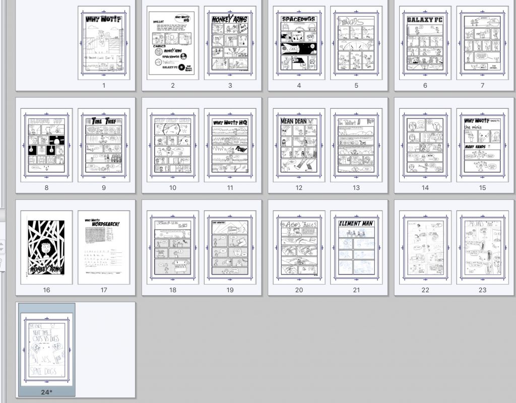
The line up of issue 1 (he has plans, we’ll see how far they go, but I’ve been slightly taken aback at how steadily he’s worked at this, chipping away a page or two a day) includes:

  • Monkey Arms (the boy with the long arms)
  • Spacedogs
  • Galaxy FC (two pager adventure strip!)
  • Electric Kid
  • Time Thief
  • Head Bump Hero
  • Mean Dean
  • Tim Teleport
  • Broken Reality
  • Element Man
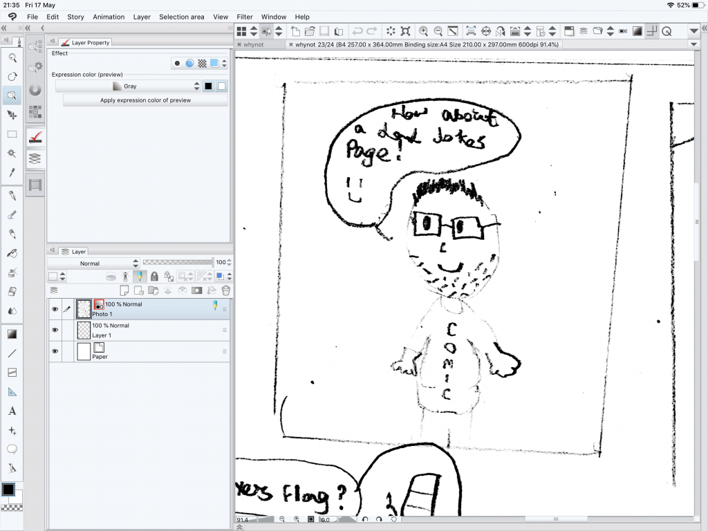
  • and a page of Dad’s Jokes (which Tom included under protest)

So we’re gonna get this thing printed up and try and price it at £2.50 and I’ll probably point a limited run of about 10 (unless, you know… people ask for copies…) One thing I’ll say, it’s been fun doing it, Thomas is very very funny.