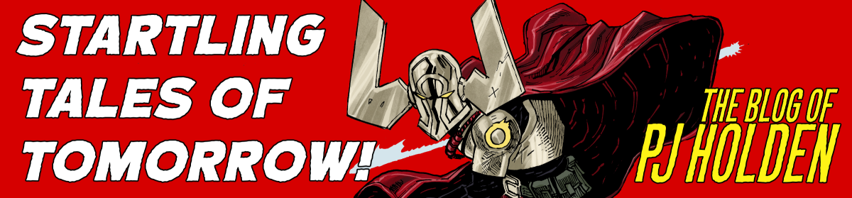
Is this the shortest comic adaptation of Beowulf? someone phone the guinness book of world records.
Oh I was so excited to get this tweet early from John.
I’ve never been into fantasy, I was hard wired for sci-fi, but as I’ve gotten older and come to understand just how much the sci-fi I enjoyed is really just fantasy with a different skin (sci-fi- it’s science – but science so advanced it’s indistinguishable from magic! so it’s just magic then? shut up brain)
But, and I dunno where the inflection point happened (certainly within the last 20 years) maybe it was Game of Thrones? maybe it was just a general boredom of sci-fi or maybe it’s the need to escape from reality into a world not permanently connected to the internet (and the news) but I’ve wanted to draw some fantasy.
(Actually, maybe it was from going to see Beowulf in the cinema in the 2007 film, which, for all its flaws, I rather enjoyed).
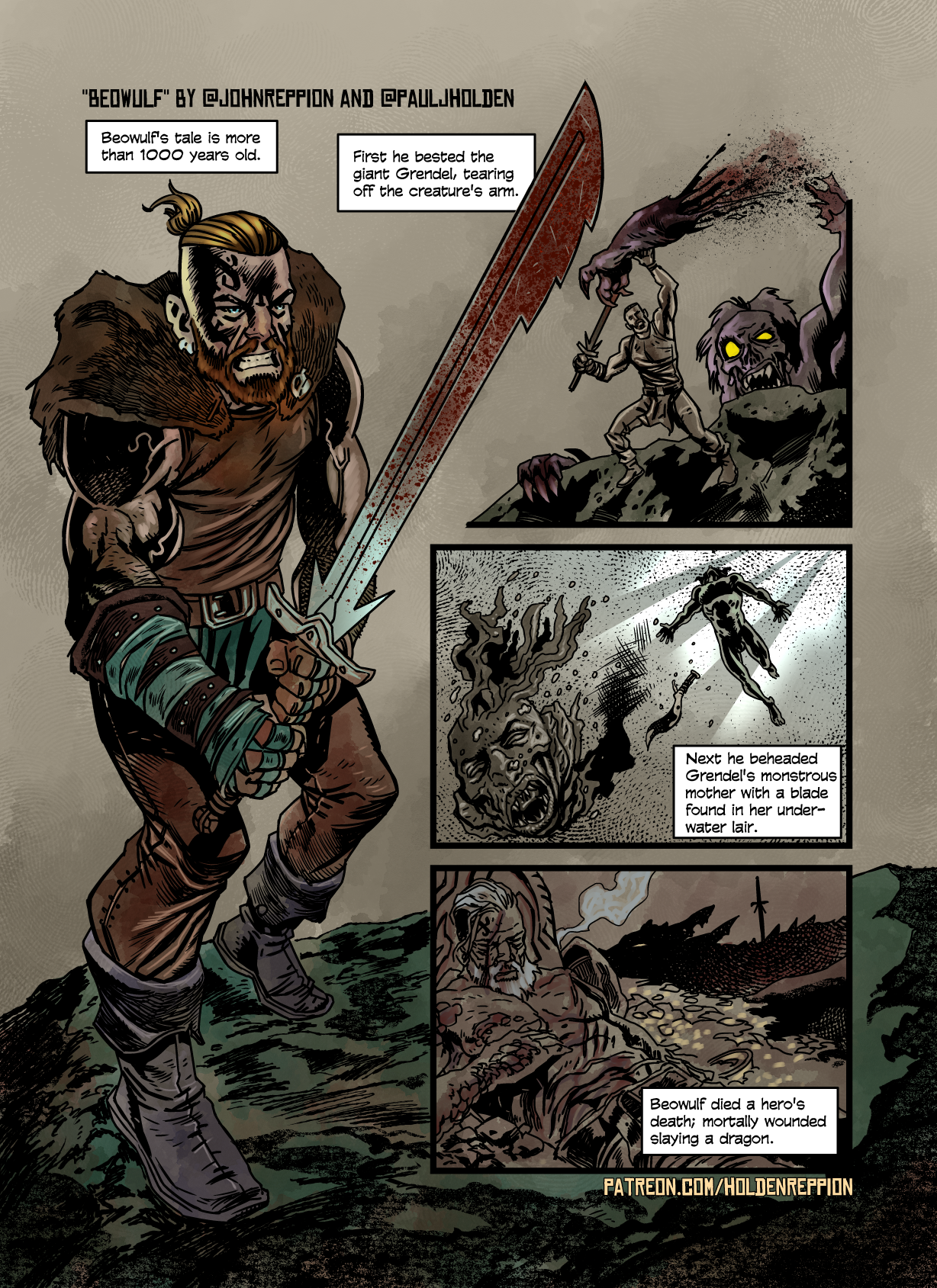
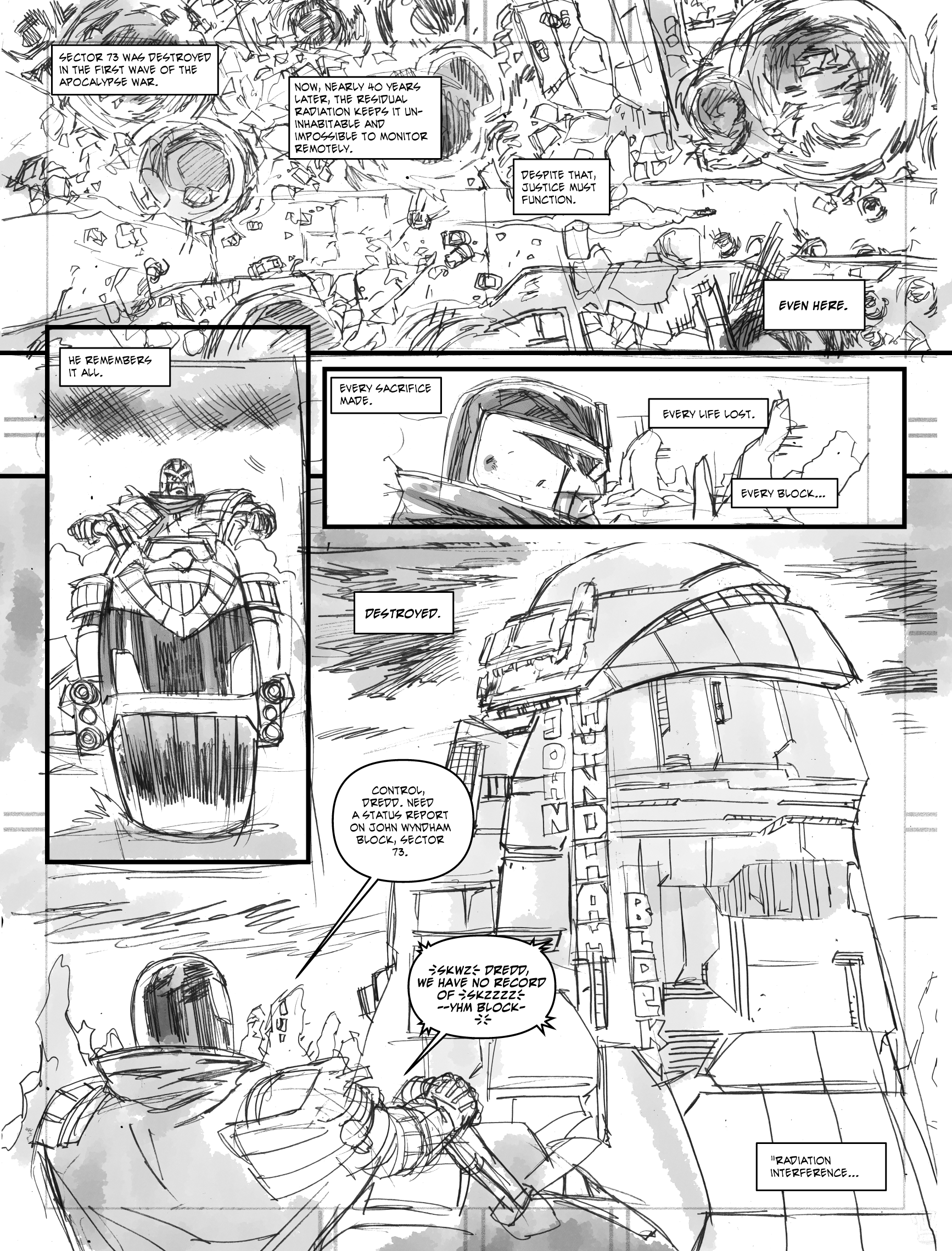
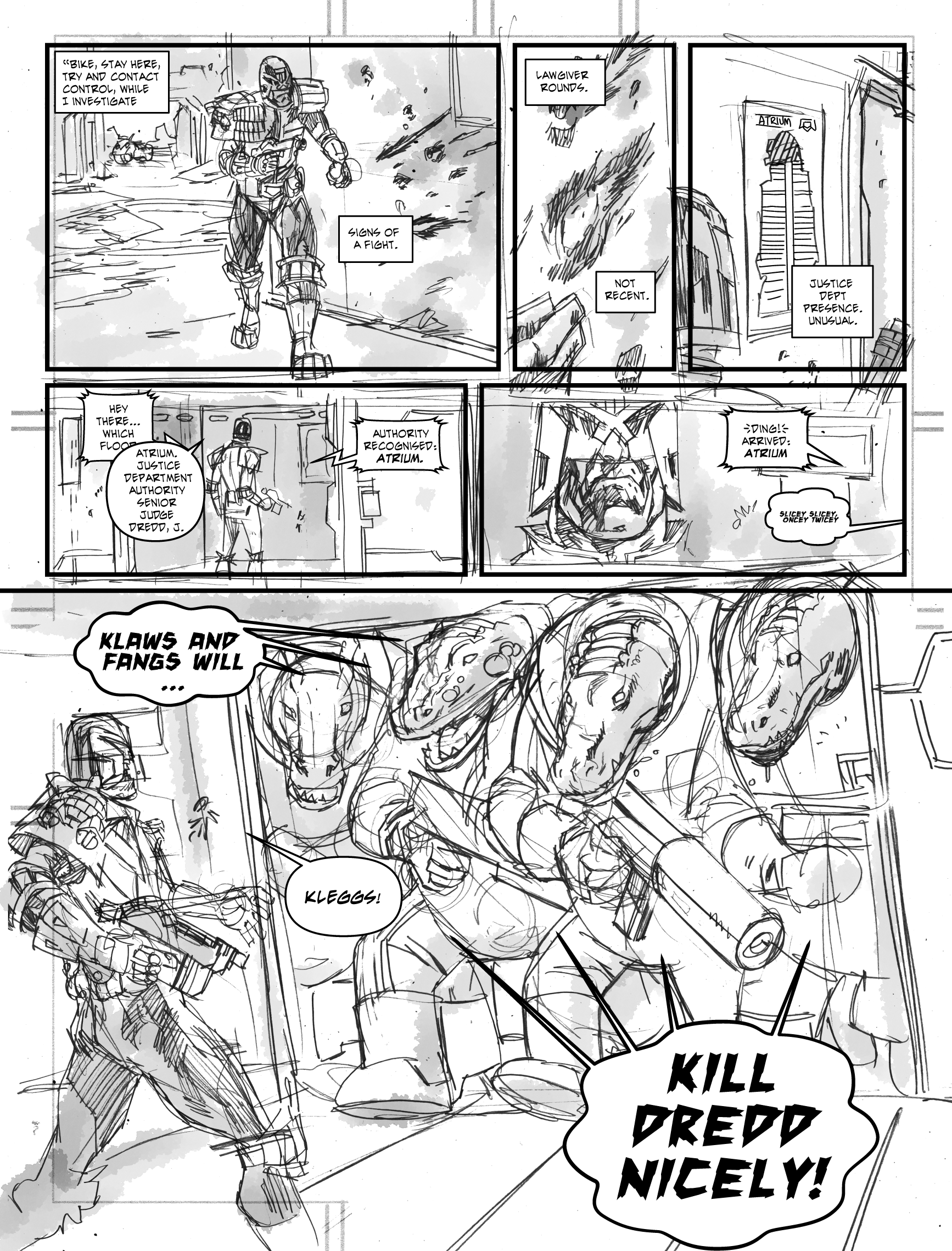
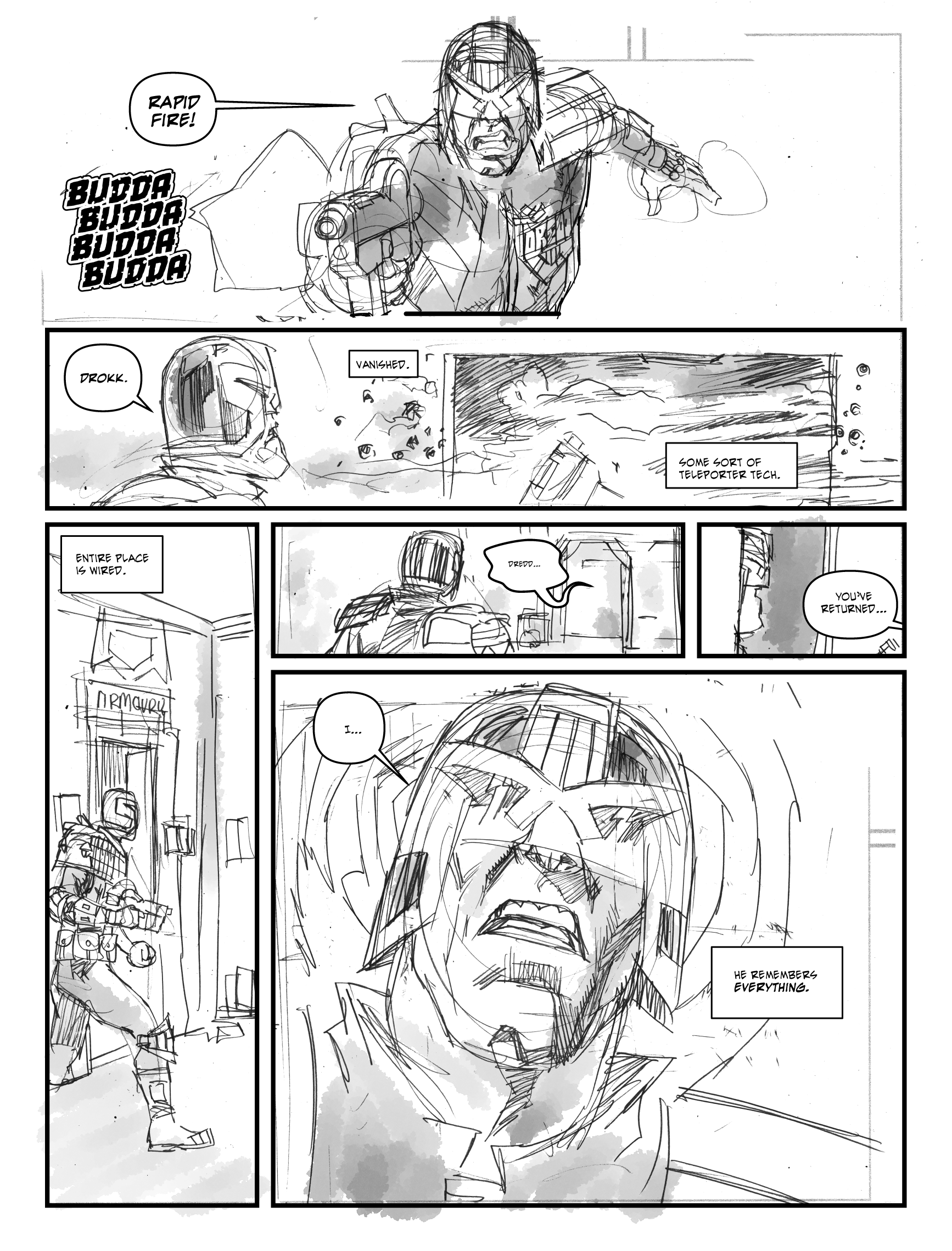
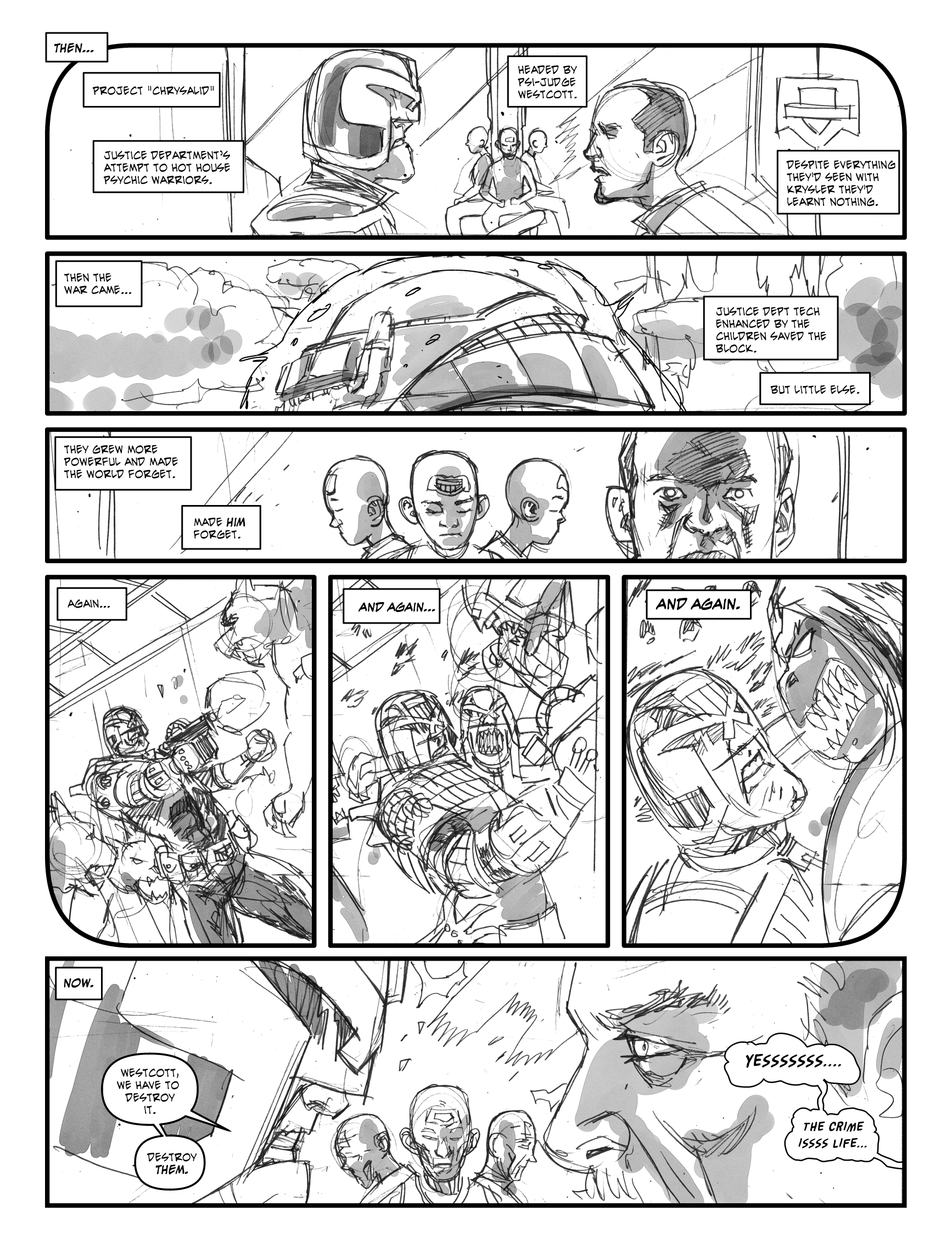
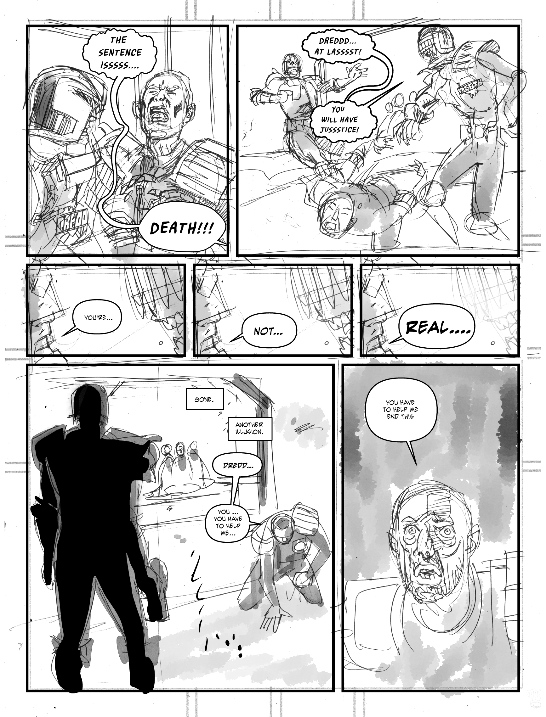
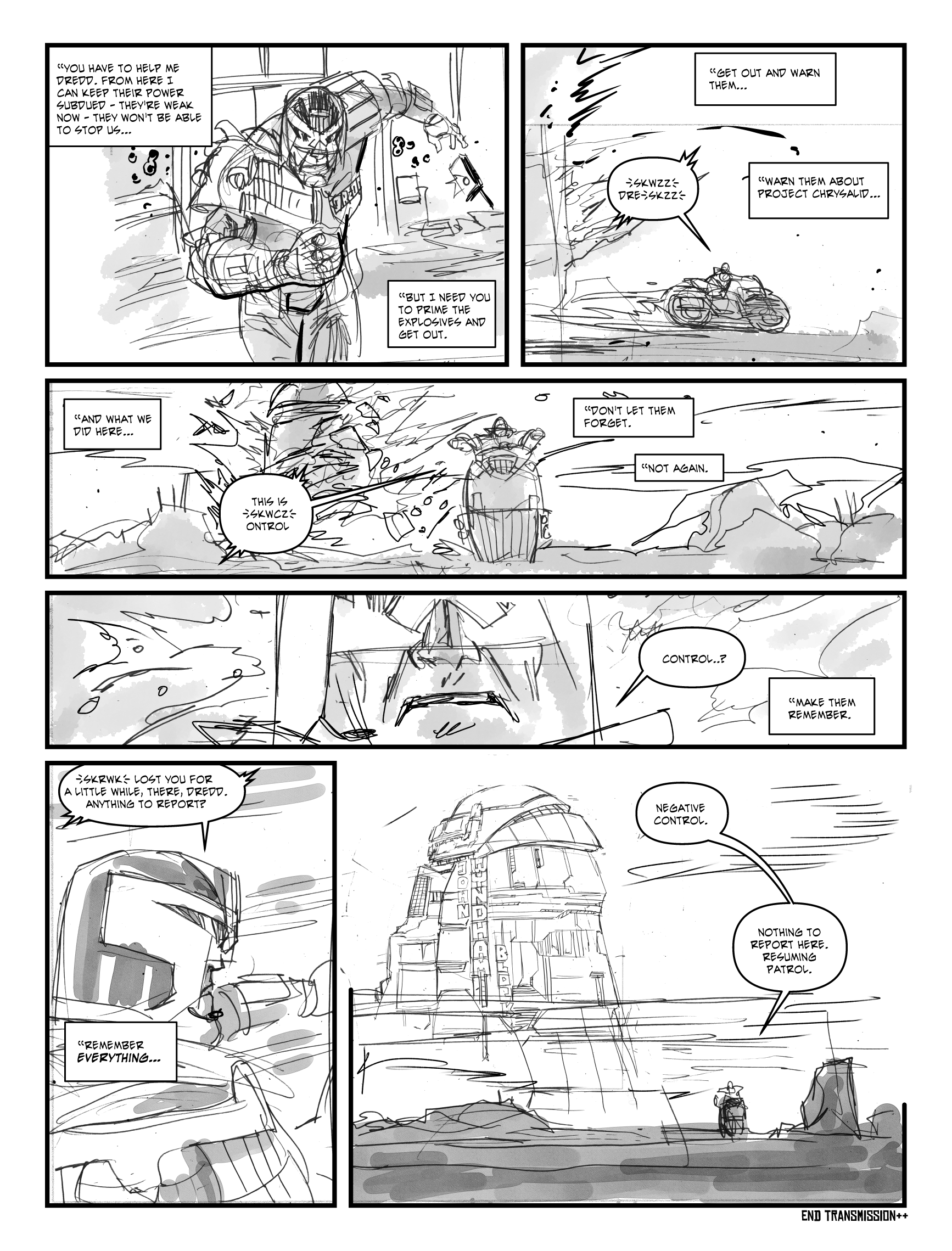
Judge Dredd is (c) Rebellion Developments, this is just a fan story I wrote, some time ago, that I thought would be fun to finally scratch the itch and draw. Or at least, roughly lay out. These shouldn’t be considered finished art by any means!
Ok, last week, the plan was to ink 6 pages of Judge Dredd Chimpsky’s Law ep 5 – and yup! all done. Took longer than I wanted, and it ended up eating into time I’d set aside for other things. But, overall, good amount of work done.
I also took the time to set and pencil the self-written Jericho-5 – a scifi story set in the 70s, time travelling floaty android, 70s tough guy cop, a dinosaur. Silly, but fun. Course drawing it from my own script involved me calling writer-me all sorts of names. But it’s pencilled (deadline on this is way way in the future, but wanted it done and out of the way)
Today I did thursday’s folklore thursday comic (pencils, inks, lettering) so it was a fairly productive week.
Plan next week is to pencil 8 pages for a Battle comic, and the last part of Chimpsky (6 pages).
That’ll be Monday – Sunday, with a channel hex day on Friday.
Suspect that’s a bit ambitious, so if I can get the 8 pager pencilled, that’ll be enough. Then the week after pencils/inks of Chimpsky part 5, the following week I’ll start inking the 8 pager, then, after that… gosh… I don’t think I have anything doing then…erk…
Ok, let’s go over what the hell happened this month, from a personal/work standpoint.
Let’s start with the positives:
Completed: 23 pages of art. Of which, 17 were pencilled this month. Five were folklore thursday strips, which I adapted from John Reppion’s tweets into comics, then pencilled, inked and coloured.
Folklore Thursday SO FAR!
On top of that, I also did 8 pages of layouts for my buddy John McCrea on the last episode of Yondu (they’re A4 sized, rough layouts that John then really went to town on and made so much better) I actually got to draw Silver Surfer for Marvel! (Albeit John went in and redraw it all, but that’s close enough!)
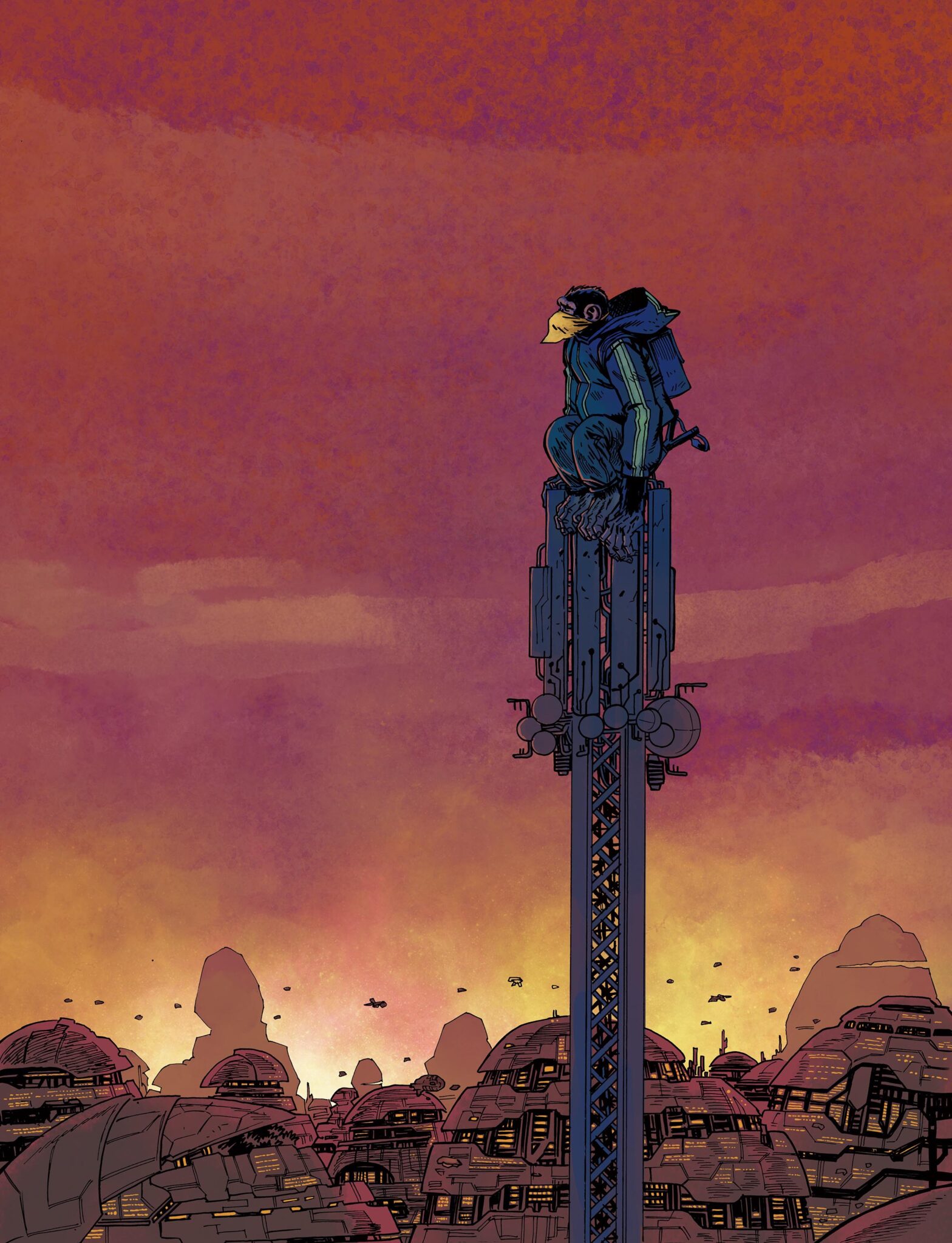
Wrote a four page strip for a kickstarter project, which I’m gonna get done next month (hopefully). It’s about a gruff New York detective in 1977 New York who finds himself bonded to the disembodied time travelling android called “Jericho 5″…
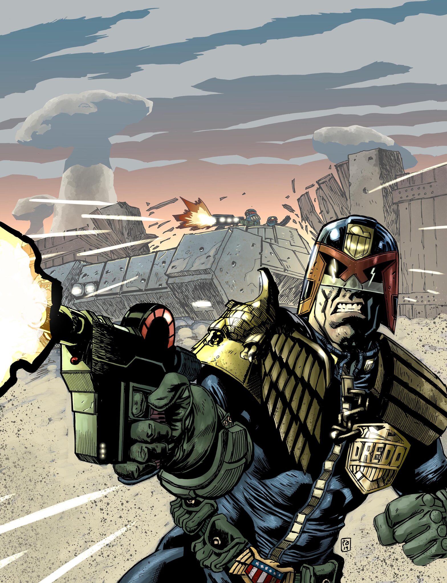
(Give it’s only the fourth cover I’ve ever done for 2000AD, I’m pretty happy with that)
2000AD announced that the strip I’ve done with Arthur Wyatt for the Megazine is coming in April out along with the news that Chimpsky’s back – in Chimpsky’s Law. And I’ve done covers for both.
On top of that, been working a new system that’s allowing me to get stuff done and not feel awful when I turn and do other things too. Trying to find a balance that doesn’t mean I constantly feel like I’m not doing enough stuff, while, conversely allowing me to do more stuff.
Health wise, I lost about a week with IBS related stomach pains (over five days spread through the month – pain kicks in around 1-5am and then the next day I’m beat). I’ve cut out gluten from my diet and now, sadly, I’ve also cut out chocolate. I’ve eaten chocolate without a problem but I think my danger is always I’ll just stuff so much chocolate in me my stomach can’t cope. Easier to cut it out altogether. If I’ve less pain next month then I know that’ll have worked (and if it’s exactly the same, then sod it – back to chocolate I go, I’m sorry cocoa-goodness, I miss you).
Channel Hex is in a bit of a holding pattern, but we’re coming back to it – it’s the starblazer sized mini graphic novellas that I’d planned to draw then kickstart. I was never 100% happy with how I’d started drawing it, and the writer is rejigging the script too. Better to be good than just done. But it’d be nice to start properly. Friday’s are the day I’m setting aside to get it complete. One thing I’ve learnt about doing the folklore thursday’s is that, if you just consistently churn out a page per week, time marches relentlessly on and at the end of a year you’ll have 52 pages (and I only spend a few hours on the folklore stuff, and colour it and write the script). Basically, patients. I’ve always been good with patience.
Now, let’s see what didn’t happen this month:
More Covers – I’d really intended to pitch a cover a month to 2000AD. It just didn’t happen. I’m in the middle of working for them and it feels weird to say “Hey, look I know I haven’t finished this thing, but what about if I also do this other thing”. I think that’s a me-problem rather than a them-problem though. I definitely intend to pitch a cover for every project I’m asked to draw, so we’ll see how it goes.
More Writing – I don’t think of what I do on folklore thursday’s as writing, but I suppose it is (esp the recent couple that are more heavily scripted than some other things). Had intended to do more, but I’ve scripted a four page short, which I plan to draw next month too.
Batman month. Wow, that didn’t work out at all. In down time I’d intended to start doing batman sketches and things – something that I hoped would get me a bit of a wider showing on twitter (Dredd hits the dredd audience, who know me already, anything new falls on mostly-deaf ears, but you hit Batman or some other thing in the big two you can expect to get it seen far and wide). Anyway, calling this a bust. May not have been a good idea, but there it is. Might try again in Feb.
Lined up for next month, so far:
Finishing off Chimpsky (one episode to go!) after that something for Battle! (I know I swore off WWII but come on, I’m not turning down a chance to do something for Battle…) and hopefully a proper start on channel hex.
That’s it, hope you had a good Jan, see you next month!
I love twitter, I’ve been there since 2006 -so just over 13 years. In that time a lot’s changed about the quality of discourse on there (driven in part by the wider world, and in part by twitter userbase growing unfathomably big) but I still largely love it. I love the curated list of people I follow (just over 4k as of right now, though that list could really be only be about a hundred since they’re the ones I mainly see in my feed) and I love the list of people that follow me (many of whom have become real life friends, but there’s 11k of you now, and I’m sure some follow me for reasons I’ll never be able to fathom).
Anyway, I think though, we’ve chucked some stuff away that was good about the pre twitter days. Specifically blogging, newsletters and linked lists.
Newsletters are starting to make a come back – every writer I know now has started building a newsletter. Many artists are following suit. And they make a great deal of sense. There’s no gatekeeping there, your audience sees what you say (well, assuming they don’t just bin it or it gets buried under a ton of other stuff).
Blogs, too, make a lot of sense. You can expand your thinking, really open it up, but also you can get a good historical record of everything that you’ve said. And while that’s sort of true with twitter, twitter is also somewhere where you can go to just sort of vent (I mean, the ideal twitter situation is you say something and once you’ve read it it disappears in a cloud of logic, vented into the digital ether). So, finding something you’ve said that really is worth rereading is almost impossible (in fact, I ended up creating a separate twitter account purely for my Clip Studio Tips as I wanted it to be just good sensible useful information instead of the normal brain farts I sully my own twitter with)
Anyway, newsletter – check (subscribe to mine: http://www.tinyletter.com/pjholden – new newsletter coming next week)
Blog – check.
Linked list. Well, I’m rebuilding it. If you want to be added to my linked list (which will also go out with my newsletter) please get in touch here or on my twitter feed.
So, last week, my schedule went like this (day in bold, plans in italics) I try and keep my plans manageable, working within deadlines. 2000AD Work tends to grant you two weeks for six pages (If pushed I can do a page a day, but if I keep it light, I can do other things…)
Mon : Dredd Layouts
Did layouts and I ended up pencilling a page and a half as well. But, of course, I felt like I could’ve done more, which is why I should’ve stuck to my original plan of only doing things I’ve written down (and if I do extra make sure they’re unrelated)
Tue: Pay Tax. Pencil two pages (1,2)
Ugh paying tax always a headache, this was sorted though. I need a lie down afterwards, but it’s down. In the end I got nothing pencilled either (well, I finished the half page from Monday) so basically back on track.
Wed: Pencils two pages (3,4)
Woops, I think I also ended up drawing another folklore thursday tale here (pencils/inks/colours), because they rejigged their themes and we needed to get back to their current theme (so we banked the one I drew for this week). Honestly can’t remember if I did any pencils of Dredd here… but I think I must have done because…
Thur: Pencils (5,6)
Finished! It was a hard slog, lots of crowd scenes (and I KNOW I’m gonna need to rethink some of the pencils when I ink it, but sometimes you just need to finish) Pages 1-5 felt like I’d forgotten to draw, page 6 went like a charm then I realised page 6 didn’t have any crowds on it. So that tells me I should avoid crowds…
Fri: Channel Hex Day.
Still waiting on script revisions, but Spent the Thursday night/Friday morning with stomach pain (didn’t get to sleep til around 5am friday), which left me out of commission all day. (I get this on a regular basis, docs have narrowed it down to IBS with a WHEAT trigger, but that doesn’t do much good, I avoid all wheat/gluten which helped some, and it’s not as fearsome agony as it has been but it’s still pretty sore and regular)
Sat: Project D pencils 1,2
Got nothing done. Was another bad night (though not as bad) unusual in that I don’t normally get two bad days in a row, so this completely keel hauled me for the day. And a bit on Sunday.
Sun: Project D pencils 3,4
Nothing done here either. Still recovering lost sleep. DID this thursday’s folklore Thursday though, so that’s something. Plus some of the day left and gonna sit and do some work right now.
Ok, bit ambitious maybe (esp given these are all crowd scenes, but I do sometimes find them easier to ink than pencil)
Thursday I’ll be catching up on people I owe emails to, and maybe .. maybe sending some submissions out further than my own network (these are more than likely just going to land and get nothing back, but you’ve got to cast if you want to catch)
Friday I’ll be sending out my monthly newsletter, and then catching up with the channel hex stuff, I’m rejigging the paper size I’m working at, so it’s a bit easier on old man Holden and my biggest struggle is finding the right art style. Normally I have a vision in mind but it can be hard to hold on to that when you’re doing something piecemeal.
Anyway, look if you’re enjoying the blog, please let me know in the comments.
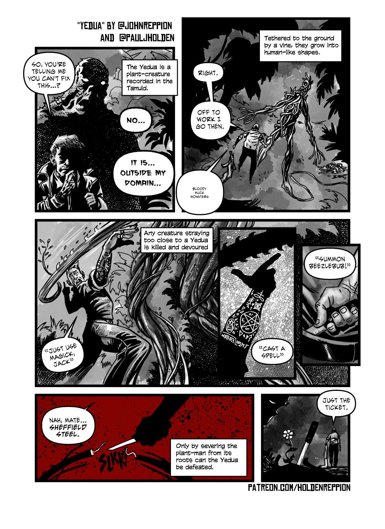
Any resemblance to creatures living, dead or fictional is entirely coincidental.
I wanted to do a one page short story, there’s a variety of cool muck monster things in fiction, and I love the pairing of god with streetwise magician (who is named here Jack)
The pencils on this show though, that it took a fair amount of fiddling to get something that I thought would work.
(And even now, having written the dialogue and then stripped it off just to upload it here, I think dialogue-free might be better?)
I’m sure John won’t mind me saying I’m taking full blame for the comic strip, John’s tweet (as contained in the captions) is all I had to go on.
I think the story element of this works well paired with the info captions. And I suspect this might be the direction I start pushing more of the strips in. It doesn’t feel like writing, though, of course, it is.
There’s a alternative version of this which is much more of a kids comic one, I started drawing and abandoned it fairly quickly.
Yesterday I’d planned out my week, then rejigged it. It was all based on the first week I did this, where I laid out the foundations for doing six pages of pencils in a week (which is, honestly, about half my normal speed) but gave me time to relax and do other things. The following week six pages of inks (again I’m capabale of six pages pencilled and inked in a week) which left me time to do other stuff.
This week I thought, ok, let’s ramp it up – which was idiotic because the point was to avoid that feeling I get to every night where I’ve done a decent amount of work and yet, it still feels like I could do more. Where the targets are undefined and so you always fall short.
Defining nice easy to achieve targets meant I’d get stuff done and then have time to relax and play in other fields, as it were.
Today, for example, I did some layouts, did a pitch image, did a page of pencils and that’s it. My plan was to do layouts (even for six pages I find this exhausting) and pencil two pages – the last layout day I planned to do layouts and nothing else.
So now, I feel like I should either spend the rest of the night frantically drawing another page of pencils (doable, but I’ll be working til 1) and still feel like a lazy pos, or I should just not bother and feel like I missed my target.
Goddammit.
Anyway, tomorrow I try and go back to my original first steps, got some tax to pay and will sort that out, and maybe get one page pencilled.
UPDATE: Yikes. Rethought it, next week’s got too much on. Pairing it back. If I get more done, brilliant, but it’s gonna look a lot like the last couple of weeks instead.
Ok, I think this is gonna be a regular series, life inside comics, I suppose.
Plan last week was to ink 6 pages of Dredd, pay my tax, and take three days to do some other things. Project D and Channel Hex stuff.
WHAT HAPPENED:
Ok, in the plus column. Inked six pages of Dredd. And pencilled, inked, coloured and lettered a folklore thursday strip. In the negative column, put off tax til next week (honestly, I find this draining, but it’s literally just paying tax), and Project D and Channel Hex got short shift as my wife and I took ourselves away for the night. We had babysitters, and so, off we went to the Galgorm hotel and Spa. As ever, when I think I’m going to relax, I start hyperventilating and have a panic about what I could be doing instead. (When I’m working I’m wonderfully relaxed). But we haven’t had a break away with just the two of us for over a year, so off we went.
Channel Hex and Project D will still get some time, but probably next week. Inking is more time consuming than pencils (certainly the way I do it) and next week is gonna be a pencil day.
Ok, so there’s a LOT more going on in this week. I’m faster pencilling, so gonna see if I can hit three pages per day pencils, Project D is 8 pages and will require some futzing in 3d software too, so these pencils will be very rough in some areas and detailed in others. But it means come
Have reconsidered, and scaled back. Far better to plan for less and get more done. Part of the point of all this is to not leave a day feeling like I could’ve done more when I’d already done plenty. Better to feel like “Yup, I did what I had to do, PLUS I DID SOME EXTRA.”