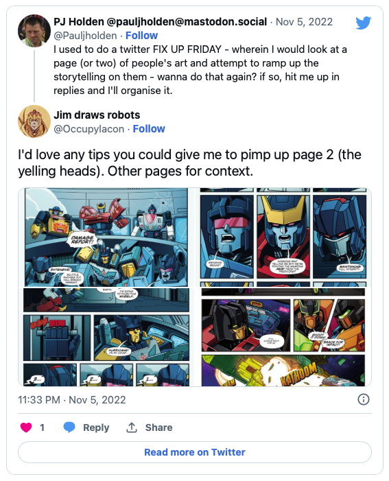
Jim Stafford (website here: https://www.jimstafford.co.uk ) said “I’d love any tips you could give me to pimp up page 2 (the yelling heads). Other pages for context.”
Firstly, let me say this is good stuff, man, what can I tell you – drawing transformers is insanely hard. Adding character to boxy shaped vehicular robots? DIFFICULT.
And I suspect I can’t tell you much, but I can say what I’d do.
So here’s what I’d do.
There’s a couple of philosophical points I wanna get out of the way first, and these are no criticisms of you (or anyone else) but purely what I would and wouldn’t do.
I approach all my art work with rhythm in mind, and how quickly people get bored. People get bored looking at incredible art if it’s page after page after page after page. We’re so hard coded to boredom, I once saw a tv show where a sea cucumber was set up beside a machine that poked it at exact regular intervals, the first couple of times the sea cucumber visibly flinched, the fourth/fifth time it reacted less and by the seventh or eight time it did nothing. Why? It was BORED. SEA CUCUMBERS get bored. We get bored as a mechanism to conserve energy and we do it at a fundamental deep low level.
(This is why reading a 22 page comic is easy and looking at the art of one is actually hard – also why if you’re going to convention with artwork to show an editor, six pages is enough, they’ll be bored around seven no matter how amazing it is)
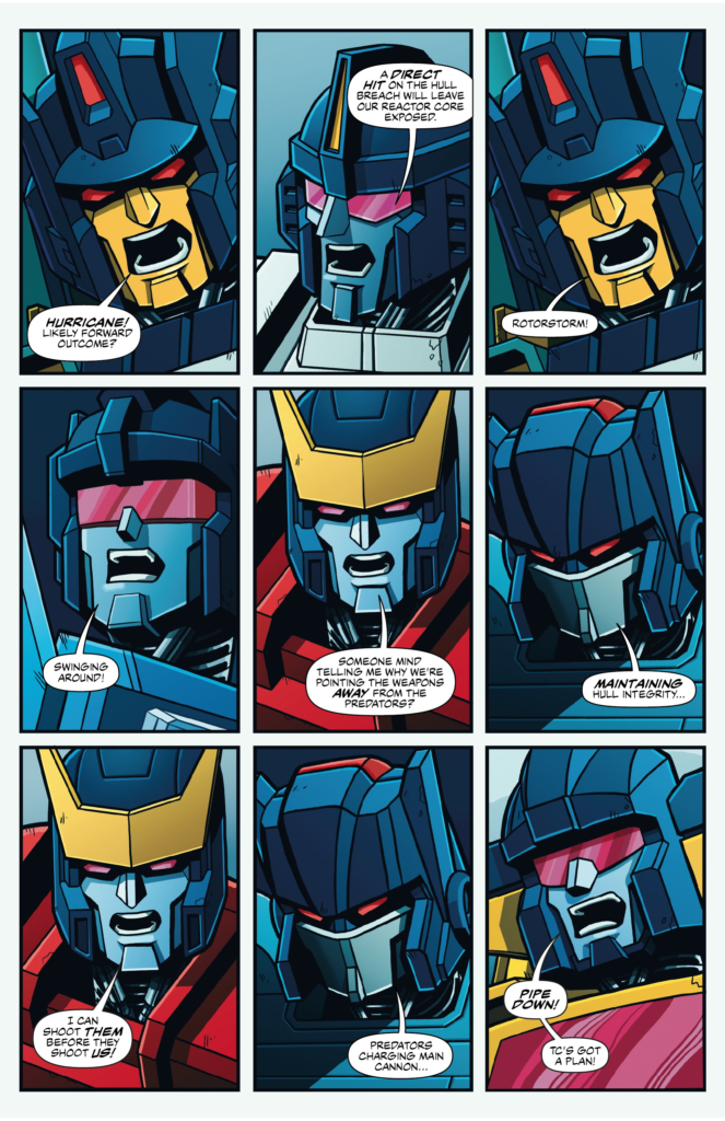
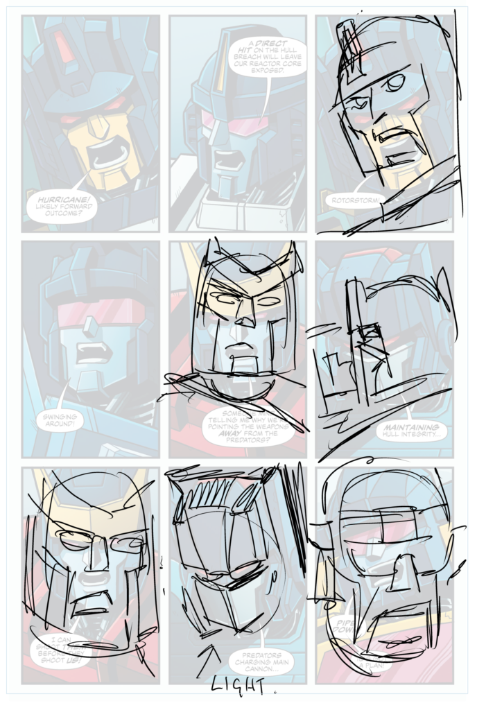
Anyway I say all this because I think the rhythm on this page is pretty simple -Every face is a shout. Every face is a close up (and often repeated faces). By varying the head angle we can do two things, one we break up the monotony a bit (same character but a different angle maybe?) but we can also very subtly cue the reader about the relative positions of each character. The page before clearly shows where they all are in relation to each other, and so, for example, Rotorstorm (in panel 4) is to the LEFT of the captain of the ship, so we have him look to his left on panel 3.
The robot dude (I’m sorry I don’t know all of their names!) on panel 5 & 7 is situated above the captain so if our camera can get a perfect shot of the captain’s head it would be looking up at that robodude. And any opportunity for a dramatic up shot is to be welcomed.
I think colour has something to say in this page too. As things get more intense that colour could be changing over the page. pushing to red or orange or similair?
Plus you can pull dramatic lighting even when you dont have the lights to do it, dramatic uplighting on panel 8 helps sell the idea that robotransformerbot is looking at a very important screen.
Panels 5 & 7 I’ve also varied the emotional response on this cylctronicmegarobotcardude – panel 5 seemed funnier if it was delivered dry – like raised eyebrow, then panel 7 a more dramatic shout. Just giving each face a slightly different emotional reaction will help a lot.
Panel 9 I’d push that shout even bigger. BIG pull in to a big reaction. Helping the reader on an emotional rollercoaster on the page rather than a kind of straight line emotional train.
And that’s it. I’ll end with mu usual caveat, this is what I’d do at this moment in time, it’s not right (or even wrong) it’s just my opinion, and I hope it has some value (even if that value is in ignoring it and saying – no – I’m sticking to my convictions!)
If you’d like to be featured here you can hit me up in email via pjholden gmail.com – stick an @ between pjholden and gmail.com and you’re golden!