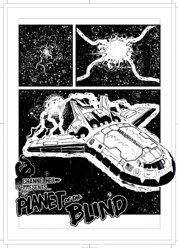
Reminder: this isn’t the final work, the final work will be an entirely different story. This is just me trying to figure out some stuff about logos/layouts/page sizes/etc.
Anyway, last time on Channel Hex, I’d planned on a commando digest size and now I’m skewing more towards a slightly larger italian digets sized – art would still be A4, but those books tend more towards 4-5 panels per page rather than 2 (ultimately it may be between 3-4) so I drew a page of the imaginary story (aren’t they all) of Planet of the Blind, and dumped some logos on there. Thanks to my pal, Jim Lavery – who put up with me doggedly asking him to help me design a logo even though I’d clearly had exactly what I wanted in mind already – who suggested a font choice that works great. So I mocked up a single page of the comic, and here it is:

There’s a little too many logos on that page, I don’t think the smaller hex-tentacle logo works at all, and maybe, on that first page i don’t need the logos at all (though the temptation to use the hexagram as a 2000ad style credits in the strip is almost overpowering.)
I’ve a colourist friend has promised to colour up the cover, so once that’s done I’ll repost it with logos/etc.
I’m keeping the actual story under wraps – it’s a corker, and exactly the sort of thing I’d enjoy, fingers crossed when the kickstarter happens (and I’m working at timing now, a tricker thing that you’d think) then you’ll hear all about it on my mailing list at Channel Hex.
