Slightly frustrating weekend. Had intended to get two pages done, got one done. So tomorrow I’ve a dredd to finish (and it’s a week late) I’ll catch up the next week (fingers crossed) been struggling with pencils (in every sense
Read More
Category: Uncategorised
Trapper Hag
Doing a thing for a thing, can’t talk about it, but doing it. Have asked someone to ink it. Can’t talk about it. Hopefully this thing gets used in the thing and the person I can’t talk about gets to
Read More
Darkseid Digital Doodle
mmm… Always frustrated that things are less realistic than I want. I don’t think I knew what I wanted from this digital paint job, but this isn’t quite it.(I like the Kirby crackle though…)
Storyboards
Spent today doing a last minute storyboarding job for a chum. There are things I’m good at and things I’m bad at. Things I’m good at I like to talk about, and I like to make big pointed reference to
Read More
Dept of Monsterology book 2
This is one of many pages I did for Dept of Monsterology book 2. This was one of the 49 pages I drew in a month. Some of those pages were, hand on heart, some of my favourite pages I’ve
Read More
Batman
From the “This project is probably dead” files.
One two, Rogues here before you…
I wanted to try and paint something in Clip Studio Paint, more impressionistic than I normally do – or at least looser. The first Rogue was done with that in mind but it totally got away from me, like some
Read More
Drawing board wip
I’m back to digital inking. Failing eyesight, and arthritis make it a better way to ink – instead of fighting with my hands and eyes and the pen and ink, I’m just battling with my ability to draw. I never
Read More
Girl
I’ve always struggled to draw pretty. Ugly, is more my metier. But I keep trying. Two good friends of mine have suggested, and I think they’re right, that US comics, especially ,thrive on “attractive”-attractive women and attractive men. It may
Read More
The Play’s the thing
Auditioned for a play. Got a part. Local am dram. Bit nuts, this is lining up to be the busiest year ever for me. But then, that’s all the more reason to do something else. Something that I can switch
Read More
-
1
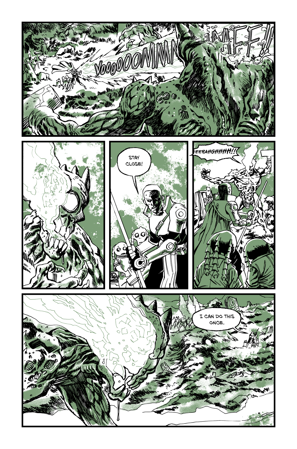
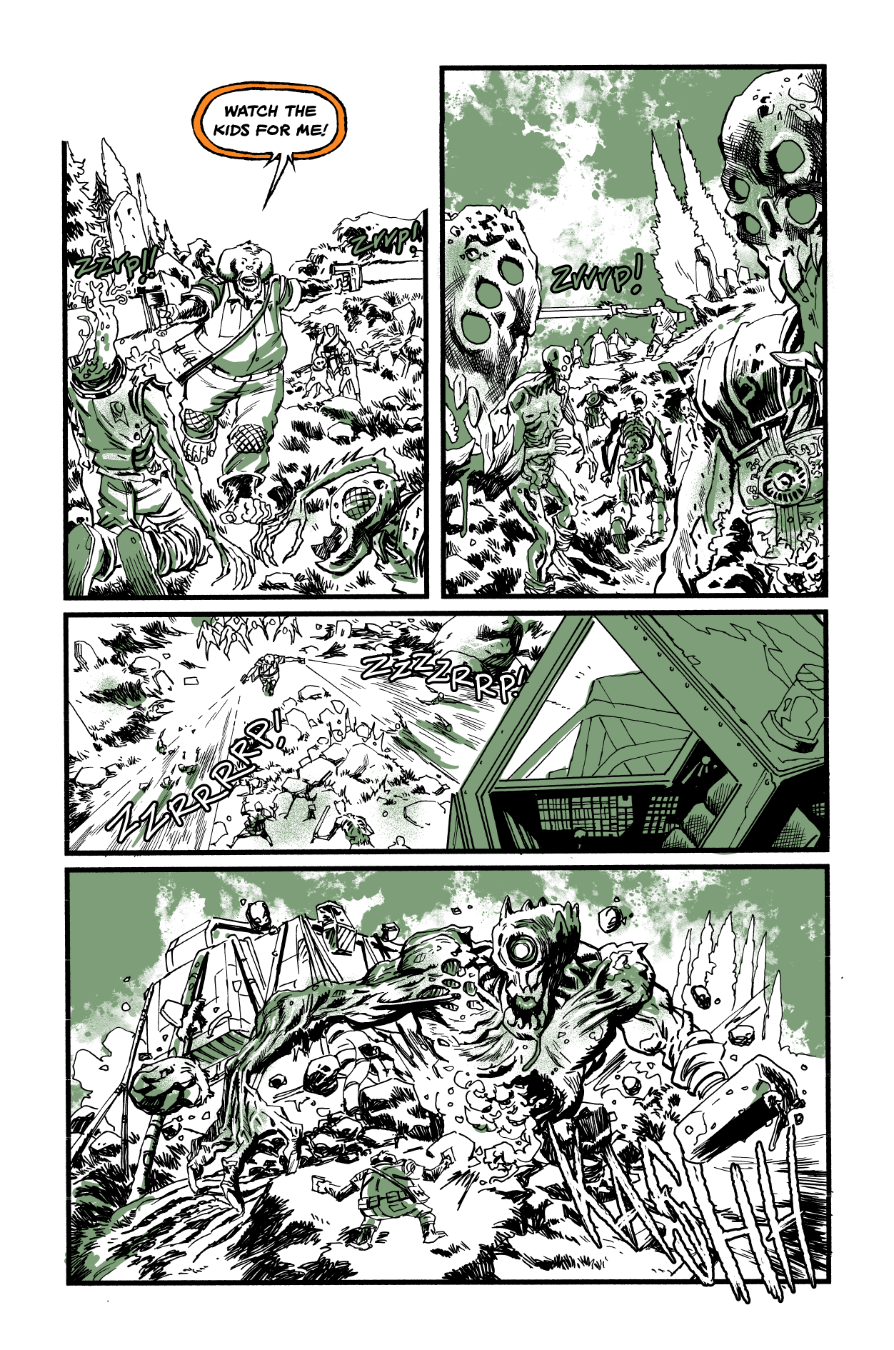
TO: The Ghosts of War ep2 pg15
5 130621 May 20, 2026
-
2
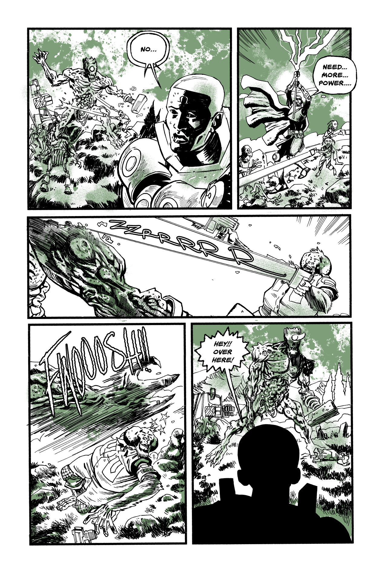
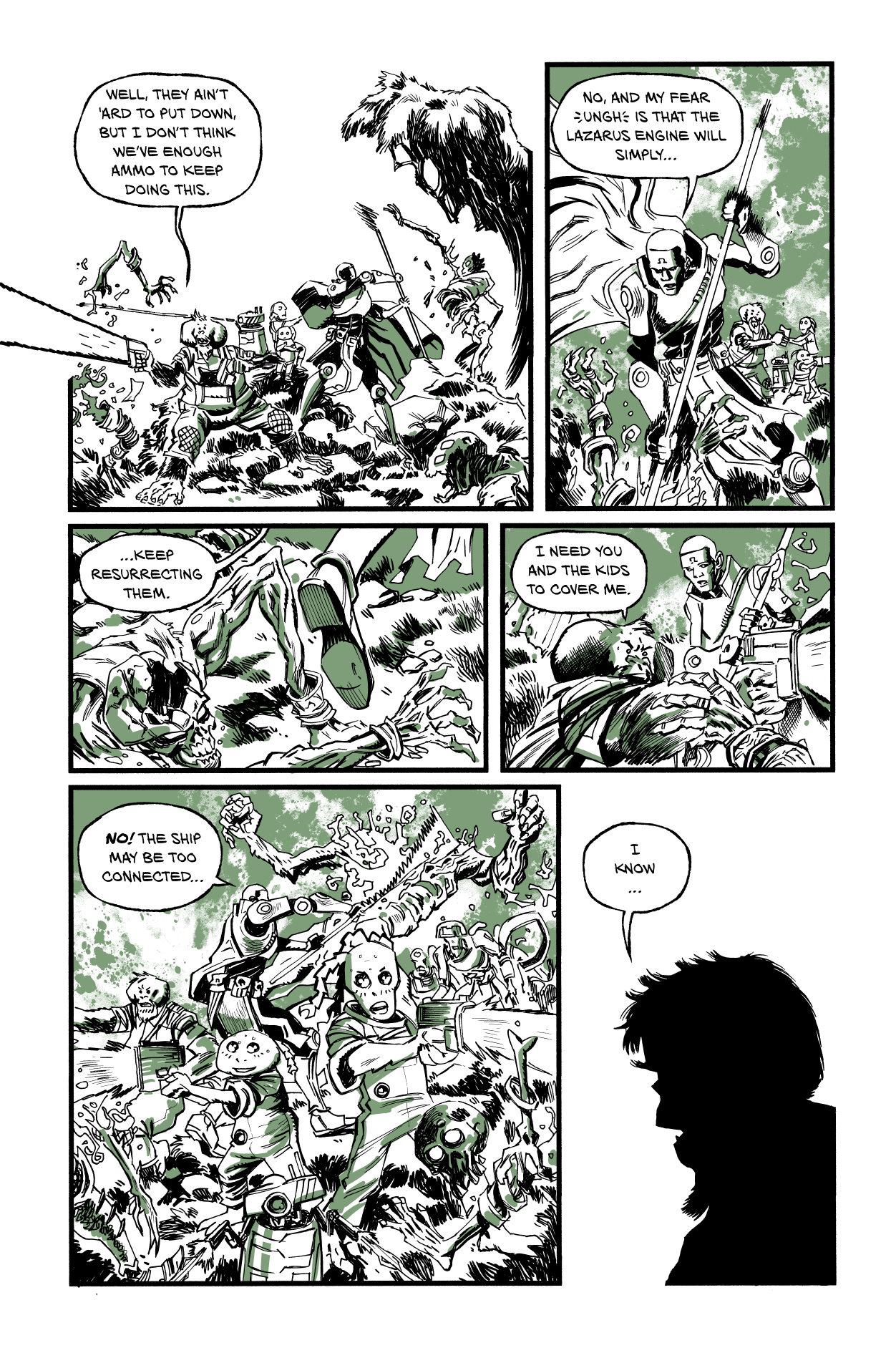
TO: The Ghosts of War ep2 Pg14
12 51985 May 13, 2026
-
3
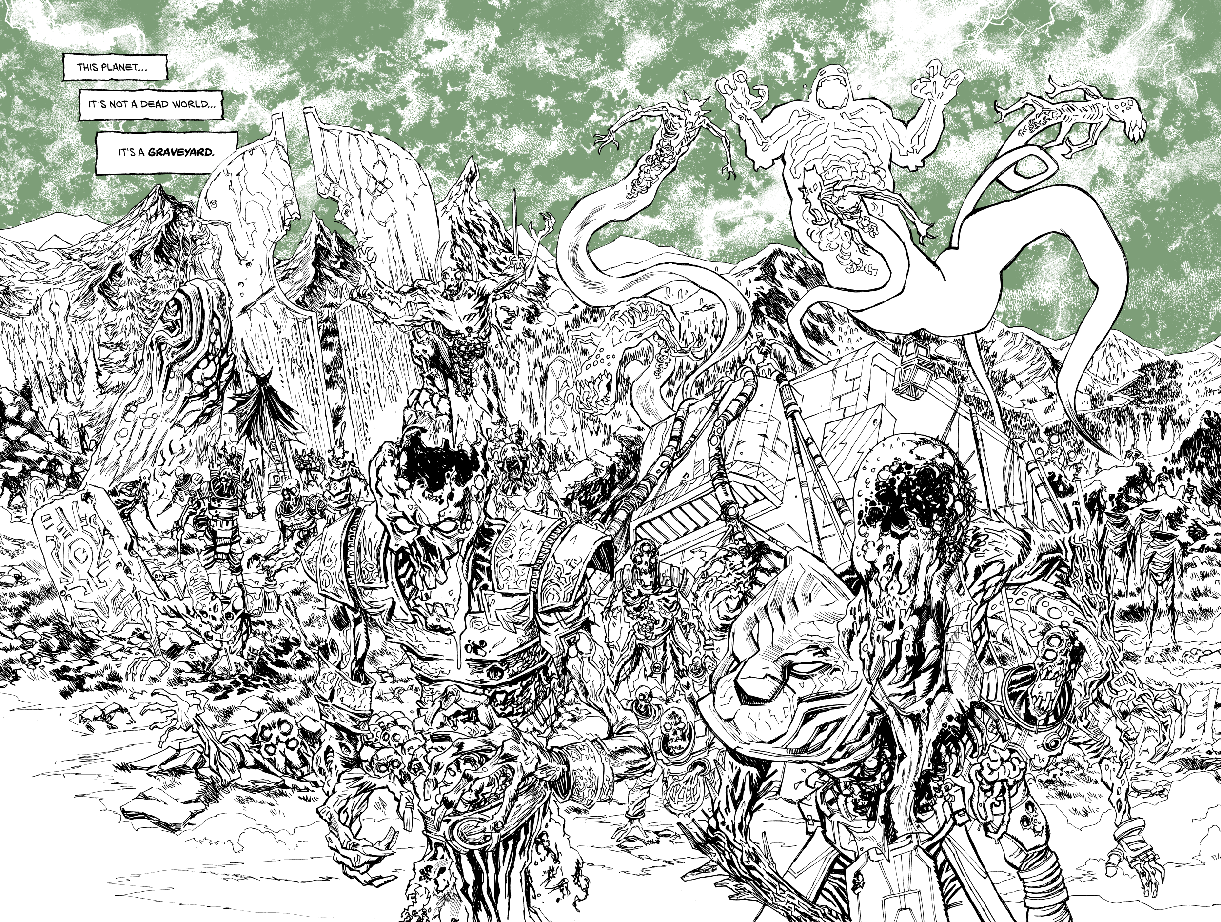
TO: The Ghosts of War Part 2 Page 13
5 32025 May 09, 2026
-
4
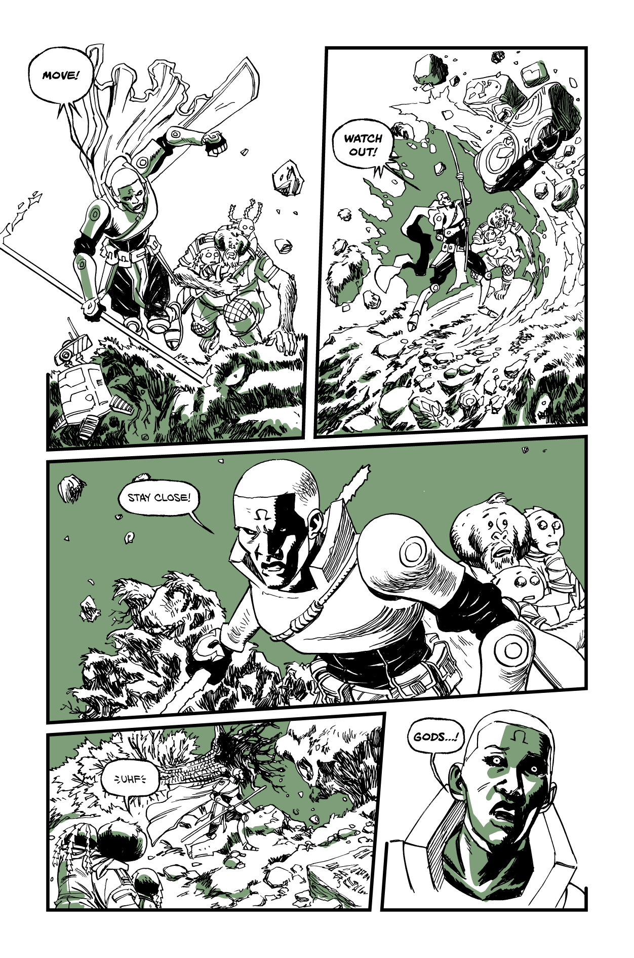
TO: The Ghosts of War Part 2 Page 12
5 3129 May 09, 2026
-
5
TO: The Ghosts of War Part 2 Pages 10-11
11 3117 May 09, 2026
-
6
TO: The Ghosts of War Part 2 Page 9
2 2864 May 09, 2026
-
7
TO: The Ghosts of War Part 2 Page 8
6 3110 May 09, 2026
-
8
TO: The Ghosts of War Part 2 Page 7
4 2963 May 09, 2026
-
9
TO: The Ghosts of War Part 2 Page 6
4 3068 May 09, 2026
-
10
TO: The Ghosts of War Part 2 Page 5
3 3055 May 09, 2026