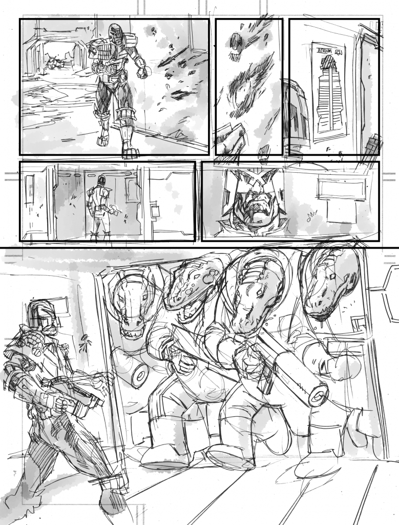
Dredd Chrysalids Page 2

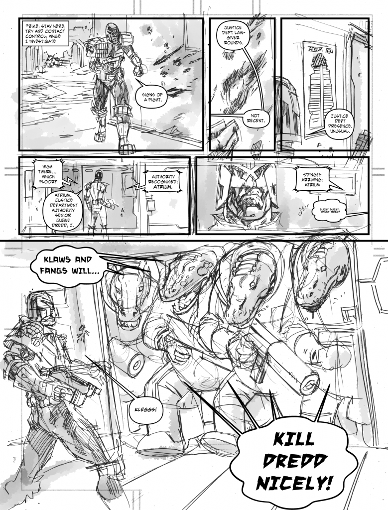
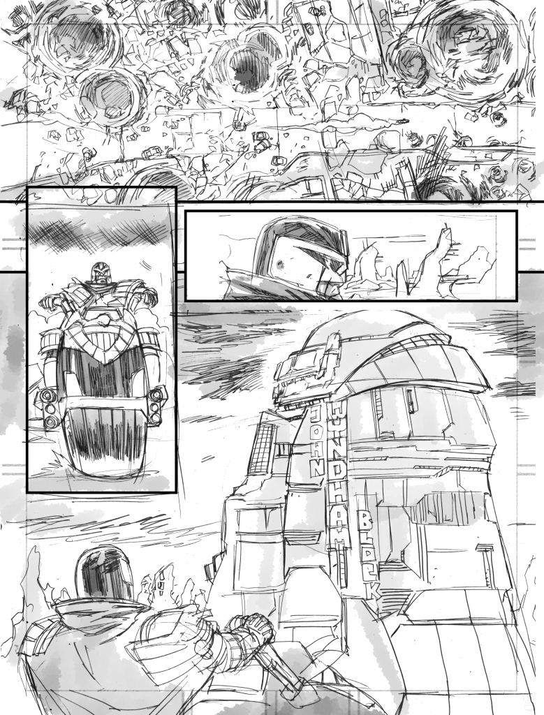
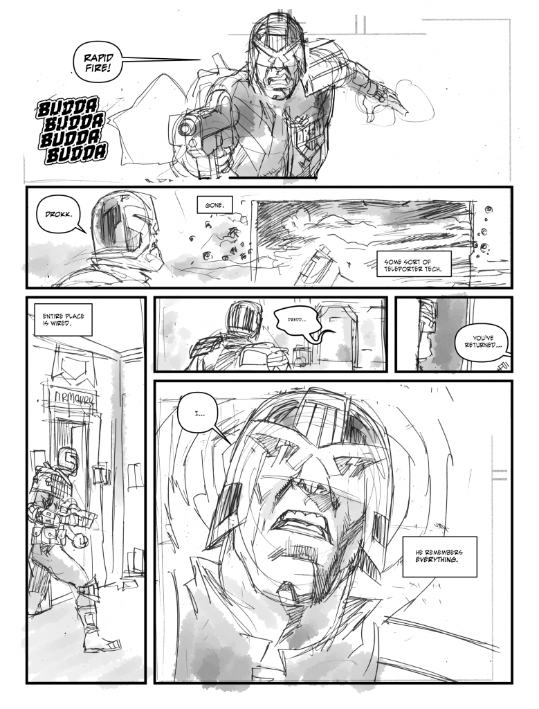
Ok, page 2. I’m less happy with the script, the art and the letters. But sometimes you need to let a wound have air to heal.

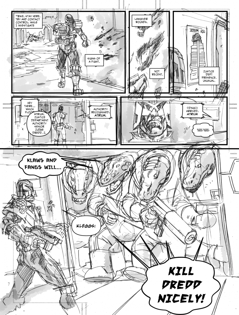
The first lettered draft of this, I had dredd muttering those captions to himself, but it felt wrong. Popping them in a caption fixed that, reads more like a dredd script. But, for your delight I’ve kept that version of the lettered art below.

I’m not sure the lift reads as much like a lift as it needs to (if this were a paying gig, I’d be spending a bit more time figuring this out) and my lettering lack-of-skills are really starting to show here. But anyway. That’s page 2.

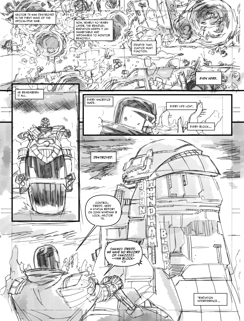
Dredd Chrysalids page 1

I’ve had a Dredd script on my hard drive for over a year, from an idea that’s over a decade old, and it’s just been sort of … sitting there… so I decided yesterday that, sod it, I’m never gonna polish it enough to expect 2000ad to print (let alone submit it to them for their consideration) so what I’d do instead is just pencil and letter it and post it here, hoping to get it all finished for xmas, so here’s page one lettered up along with behind the scenes commentary…

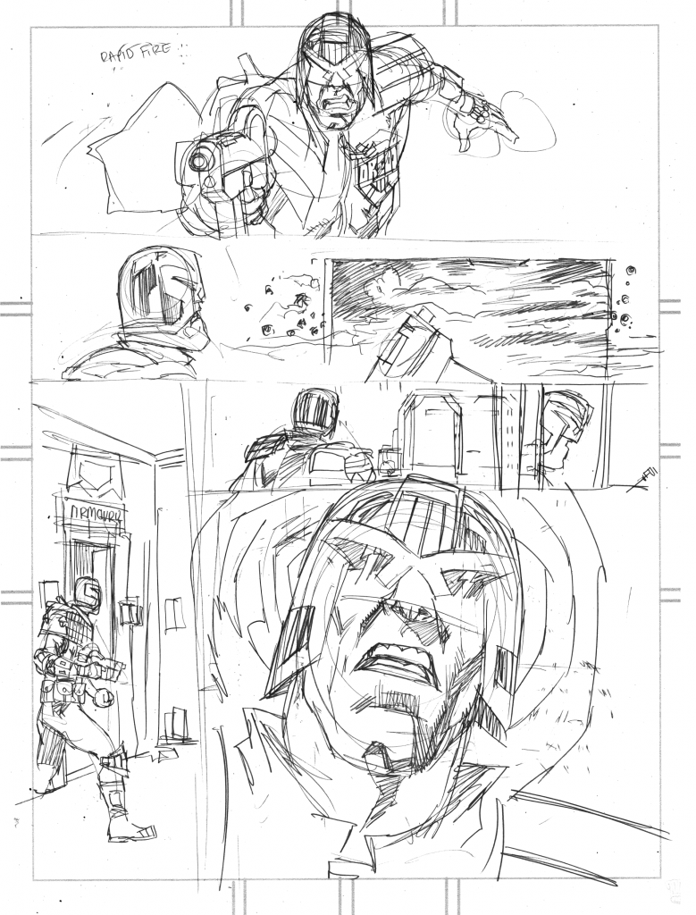
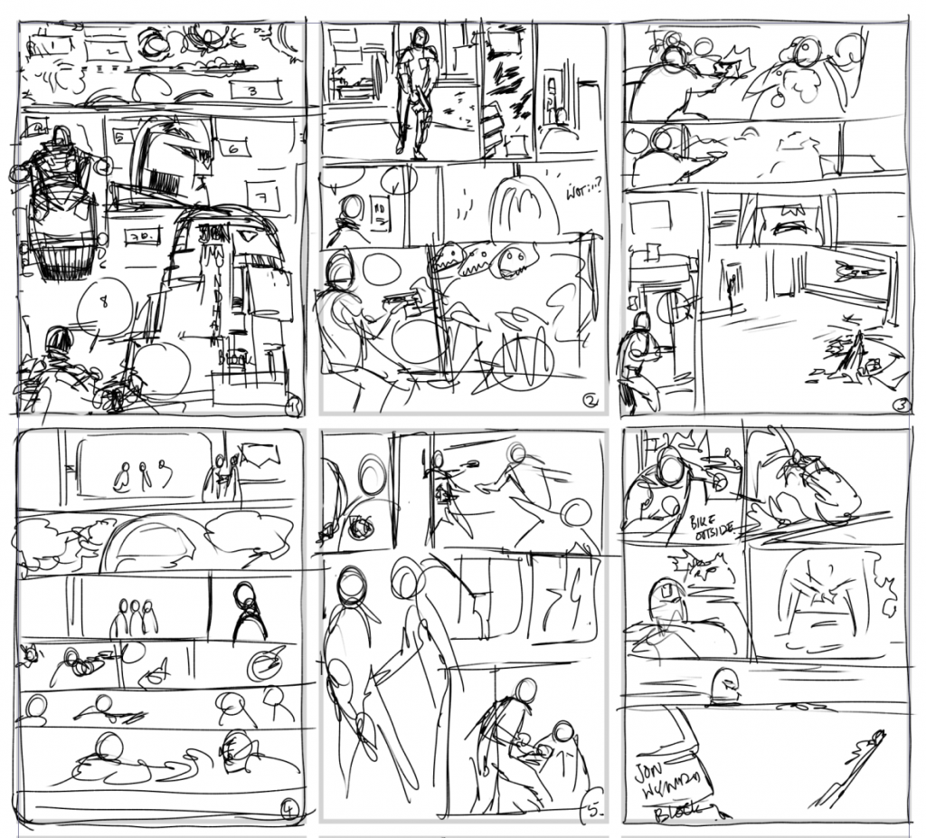
Ok, I’ll not post the script up, not until it’s all done, but here’s the layouts (which are largely impenetrable by anyone but me, and get more vague as they go along) page 1, as you can see, maps pretty close to the final pencils.

Lettering by me, using Evil Genius font from Blambot (home of many fine, fine fonts). Normally I’d ask Jim Campbell to letter any of these stupid ideas and I’ve no doubt he would’ve done a much better job than my hamfisted approach – but it’s nearly xmas and who wants to do unpaid work at this time of year? (Apart from me, apparently…)

Layouts:

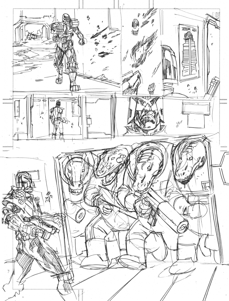
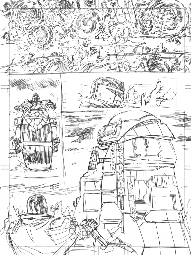
And here’s the raw pencils for page 1… Scanned and tidied, added panel borders, resize a couple of things, made panel 2 push into panel 2 to just force the readers eye a bit to that panel (I had planned to have Dredd’s head here jut out of the panel, but that would have made it hard to place lettering)

I printed a template out in Clip Studio that shows me the safe area and some guidelines for drawing some standard panels, then pencil on that – I don’t pay too much attention to getting the borders exactly right as I take this into to clip studio and add panel borders digitally, ordinarily I’d then print that out – with the panels as blacklines and the pencils as a light cyan colour (ie a ‘blueline’ pencil) and ink over that, but since I won’t be inking this …

I decided to greywash it instead

And that’s it for page 1. If anyone fancies paying me to ink this page and owning the original artwork, you’re more than welcome to contact me at pjholden@gmail.com

Folklore Thursday: Cat

“John, look, I think we need to get engagement on twitter up. The internet loves cats, so whatever the NEXT folklore tale is about — I’m drawing cats”

And thus, John sent me this:

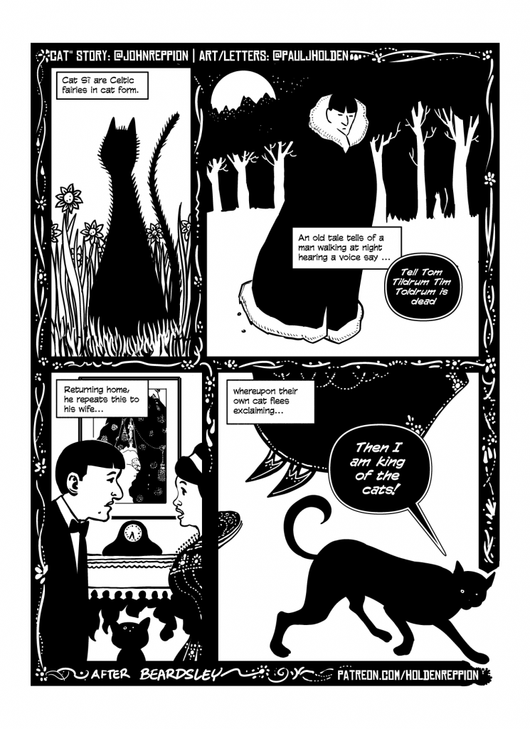
Cat Sí are Celtic fairies in cat form. An old tale tells of a man walking at night hearing a voice say “Tell Tom Tildrum Tim Toldrum is dead”. Returning home, he repeats this to his wife, whereupon their own cat exclaims “Then I am king of the cats!” and flees. #FolkloreThursday

I’ll be honest, no matter what John sent, I was drawing cats. I’ve got to find ways to amuse myself.

Anyway, Not only was I thinking cats, I was thinkig Aubrey Beardsley

And here we are. Usually ideas like this are about making sure I’m trying new things, if I can constrain myself in some way (esp if it’s a thing I never normally do) the thinking goes (well mine does) this might spur me into new stuff.

Beardsley, though, frustratingly, doesn’t seem to have drawn many cats. (No great surprise, he was a startlingly young 25 when he died) and so I was stuck with how to draw a Beardsley cat. Panel one cat was drawn on the basis that he tended to draw very wide bottomed figures, art noveauesque shapes. So I cobbled a silhouette around that. The spikes I added much later when the whole page was finished, partly because Beardsley did sometimes add fringes on to black areas, and partly because I wanted it to have some sort of air of the supernatural or – mostly – to differentiate it from the cat on the last panel. As it happens, the spikes I added made it look like Mog from Meg and Mog and that amused me, so in it stayed.

Panel 2, it’s Beardsley himself. A young man, never married so this is, clearly a fictionalised version of him. Beardsley’s work seems to have large black shapes (often fringed with white dots or black) and large clear white space. So it’s trying to figure out how to balance that all. Very pleased with the lettering balloon – done in Clip Studio, which is not a brilliant tool for lettering, but this was an easy effect to make (black on white balloon, white text, then the entire layer is given a black outline)

Panel 3, Beardsley and wife – just made her up. The picture behind them is “self portrait in bed” by Bearsley

Panel 4, finally our cat walks out – this is a Beardsley cat – taken from Pierrot and cat, from St. Paul’s – I’ve had to add a couple of legs as the original is behind another figure.

And the decorative around the frame element was important, but I felt I needed to get the thick black border for the full on Beardsley effect.

Hope you like it! One more to go before we call this year done, the next will be the last for the year, and it’ll be very wintery…

Folklore Thursday: Vrillon

This was a lot of fun.

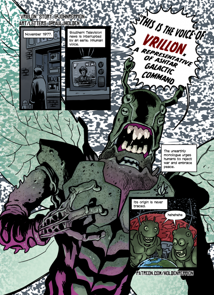
I’ve been itching to do a scifi-ish tale with one of the folklore stories since we started (I am, at heart, a 2000AD artist, scifi is the norm for me) I honestly didn’t think we’d ever get to do one, but this presented a neat little departure. And I hope the twist in the tale end of it comes through (because I always need to explain the jokes: it was a hoax! AN ALIEN HOAX!)

I thought drab dreary 1970s england colours set against bright colourful alien life would be a fun contrast. On first pass of the thumbs I drew for it I thought I couldn’t draw an alien, because… well, the alien is never seen, but then I figured that would give me the freedom to do what I wanted – it’s an alien in the imagination, so he’s superimposed on a static TV background (I created a layer in clip studio, filled it with black, generated some perlin noise that was nice and big, then smeared some of it, then converted it to lineart – that gave me the static I wanted.

Anyhow, hope you enjoy it!

Journal

I’ve been keeping a journal this past week, based on the Bullet Journal format.

The Bullet Journal is, basically a way of organising a notebook into something like a diary with a todo list. There’s a lot of hoodoo that makes it feel a bit cult like – but the essence is “here’s a way to organise a todo list”. Like the pomodoro technique I think it can be useful.

There’s a lot to the Bullet Journal stuff, though, honestly it’s not that complex (the magic is: You make your own index, add page numbers to all pages and then allow yourself to find how you can use it best)

I’m finding it useful, though my life isn’t busy busy – there’s lots of grind in what I do, sit down draw a page, do the next page and repeat forever. But it is helping me find myself on top of other out-of-comics stuff.

So, here’s some additions I’ve made to my bullet journal:

Threads

Threading bullet journals already exist, basically if you run out of room on a page, you simply write, at the page number below it the next page that you should go to (and if you’ve multiple books you could write 2.23 to indicate book 2, page 23). I’ve ramped up how I use threads, for indicating a page (say for example I have a to do list that says “• Podcast recording ” I’ll add an indicator for the page where I keep my podcast notes, the indicator is drawn like a simple bookmark:

I’ve added a Collection (Bullet Journal speak for a couple of pages of notes on a very specific topic) for Podcasting (just lists of topics) as well as a double page spread for keeping a note of my stomach pain from IBS (I’ve drawn a little calendar where I’ve put red in the dates where the pain has kicked off, along with a graph showing the pain intensity along with the time of day – there’s space there too for writing whatever food I ate that might have kicked the pain off)

Finally, I’ve a Collection of Comics Projects – drawn as gridded boxes based on my previous Schedule page, this helps me keep track of what I’m drawing, what I’ve drawn and where gaps in my schedule are. As I do pages I draw completed bullet points to indicate when I’ve drawn them, too.

I’ve been doing it for a week, having seen many many bullet journals, I started off by drawing inspirational quotes, decorative elements and all sorts of idiotic elements to it, but really, the big key for me is using the index and threading to go to the next or previous pages, has helped me get some more boring admin stuff done (stuff that I tend to forget, and have to do at the last possible moment).

Anyway, we’ll see if I can keep it up. I’ve been dragging the log with me everywhere, constantly updating and checking it and making stuff happen.

22,000 panels that always work

Yes, it’s a four blog post kind of day.

I love twitter, but stuff gets buried, and it’s harder to do long form thinking on it.

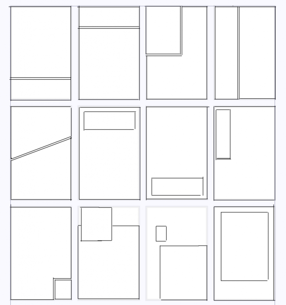
Anyway, was thinking today (after stumbling across this procedurally generated maps of cities for dungeons and dragons) that it would be cool to do something similiar for comics. Something that could give you a whole bunch of panel layouts generated from a bare minimum of input. You put in the number of panels and it gives you a dozen layouts. You could select one panel and make it an exterior, or another and make it inset, and click you’d get another dozen layouts all keeping that in mind.

I’ve always been fascinated by the grammar of panel layouts. Let’s take the simplest count of panels: 2.

Here’s a bunch of options:

And that’s before you get into bleeding images off the page, circular panels, batman shaped panels or what’s even in the panels.

And some of these I think work better as first pages, and some work better as last pages (notably, the second panel being smaller, or inset below the midline of the page feels like a full stop on a page).

Three panel layouts explode your options, and it just gets wilder and wilder.

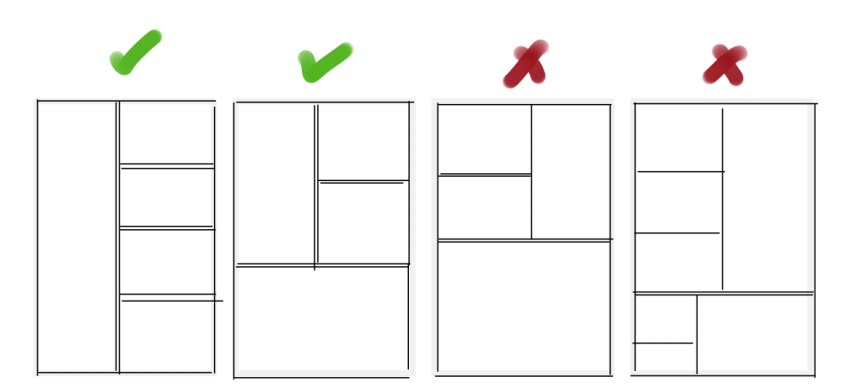
And I like nice readable panel layouts, so there’s some rules I’m a real stickler for, I love stacked panels, but stacking order is important:

Stacking on the right of a large panel is perfectly readable, stacking on the right can be illegible (though clever tricks with lettering/art can make it more readable, but really do yourself a favour and don’t do it!)

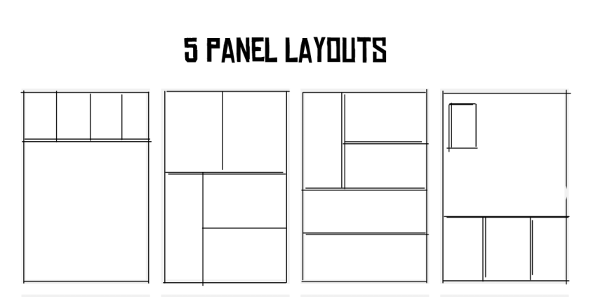
And here, dear reader is some examples of five panel layouts:

I keep meaning to (though never seem to have the time to) go through some of the great works (Dark Knight Returns, Watchmen, er.. probably others) and draw out their panel layouts. I find them fascinating.

(Of course, Hass, of “Strip Panel Naked” has gone in to depth about panel grid layouts and I recommend you go and join his patreon/watch his youtube!)

Folklore Thursday: Chronos

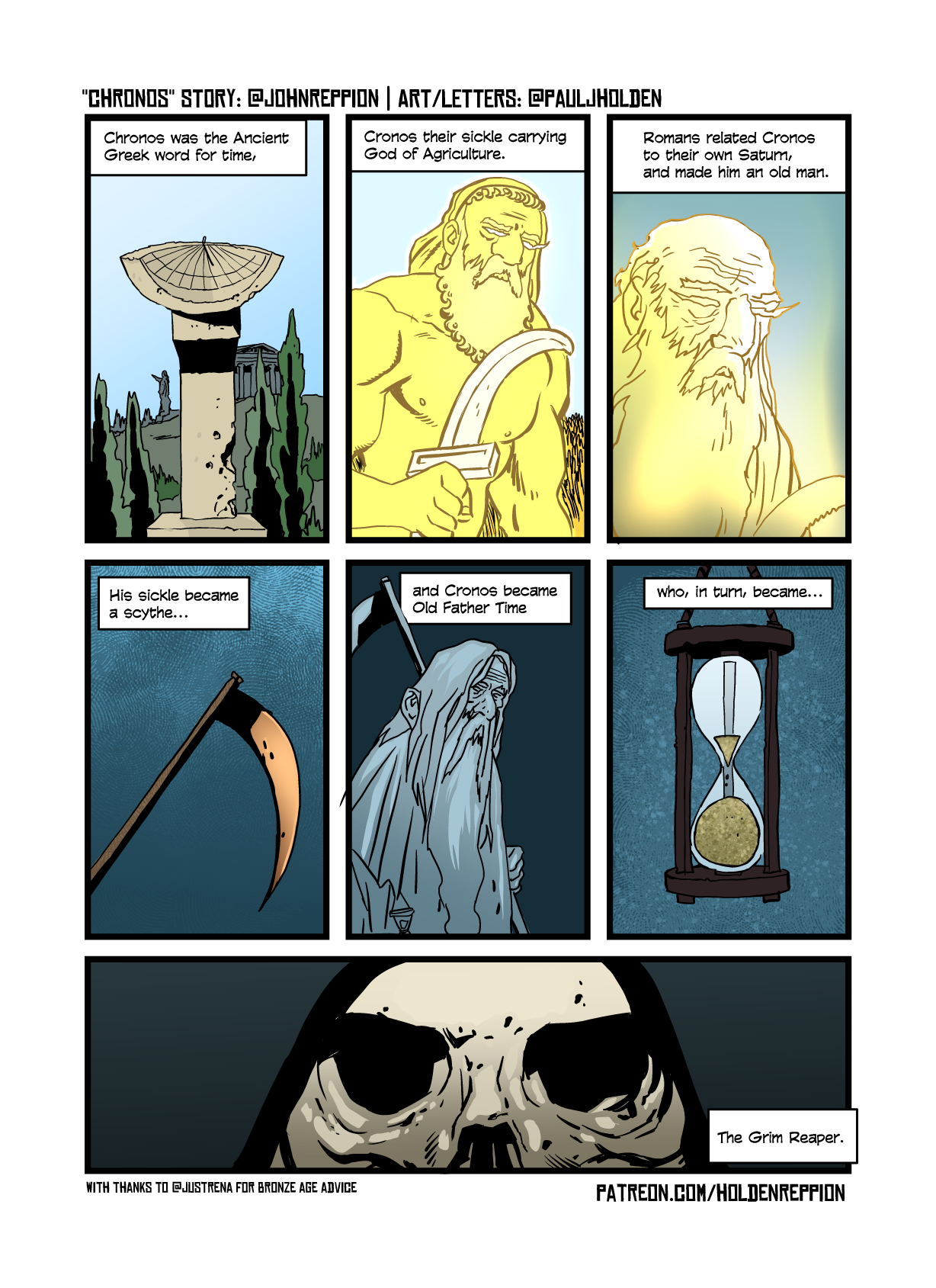
Chronos was the Ancient Greek word for time, Cronos their sickle carrying God of Agriculture. Romans related Cronos to their own Saturn, and made him an old man. His sickle became a scythe, and Cronos became Old Father Time who, in turn, became The Grim Reaper. #FolkloreThursday

John Reppion

As befitting a strip about time, my time has not been my own the past few weeks, so the resulting strip isn’t quite what I wanted, but it’s good enough for government work (as they say)

One thing I like doing is a little bit of research, and panel one, the first sentence was an opportunity to ask yourself some questions – like “wait, what DOES and ancient greek time keeping device look like”. So I googled it and got this odd looking sundial. Now I have a new friend on twitter, Dr Rena, an archeologist and expert in this time period and she pointed out that this isn’t wrong, BUT more common would’ve been a water timer – but I’d already drawn the damn thing, and that at least looked like a thing I’d recognise as a time keeping device, whereas the water timer just looked like two pots.

I wanted, in the strip, to get across how simple and obvious the transition from Cronos, to Saturn to Old Father Time and then the Grim Reaper. I think I did that, but it’s clumsy and not at all subtle, but I am pretty happy with how that last grim reaper panel turned out.

I’m always making decisions about the rhythm of the strip, and these one pagers are interesting exercises in that. The tweet informs the panel layouts, but the panel layouts also inform how I’ll handle the tweet’s breakdown – in a neat little feedback loop.

I’ve always been interested in panel layouts, I used to keep a notebook that had a bunch of interesting panel arrangements, I’ve always preferred simple, straightforward reading experiences, but even with that limit (a zig zag panel layout) there’s a billion ways to slice it. But some panel layouts work great at the start of a book and some work better at the end. Middle is more open, unless there’s a scene transition in there.

It’s a fascinating exercise to open up a favourite book and just draw out the panel layouts. (For a certain level of fascinating, that is…)

Anyway, that’s your lot. Tempus fugit!

Schedule

“How long does it take you to do a page?”

Every comic artist has had to answer that one at some point (and more often than not, they have to answer that one over and over again, both to fans at conventions, to family and friends who’ve no idea and to other working professionals, and finally, most hauntingly, to editors…)

For me, the answer is and will always be: a page a day. (it’s also reassuringly definite)

I mean, it’s a lie. Sometimes I can do two (sometimes three!) pages per day (3-4 hours of solid work can get a page done depending on what’s on it) and sometimes a page refuses to cooperate and can take a week or more (I mean, only when the deadline has the slack built in, otherwise you’re shooting yourself in the head doing that).

There’s a good blog post here about schedules and working within deadlines. They talk a lot about 200 page graphic novels (longest I’ve ever done is 174 pages, and it took a year – longer than I’d anticipated owing to family illnesses)

To help me work through deadlines and jobs, I sometimes use my “comics calendar” – it has 25 boxes – representing 25 pages for each month.

If I can get through each month and tick each of those 25 pages then I know I’m on schedule.

Sometimes I’ll adjust that up or down, for me 25 pages is doable (I’ve done 50 page months before… they were pretty good pages, but it is hard work)

I’ll combine this comics calendar with a proper big wall chart calendar, so I can keep track of when I’m doing work and how much. Subscribing to the Seinfeld joke writing method – essentially put an X on every day that you draw a page, and keey going til all the Xs join up.

And if you work full time and a page a day is just an absolute impossibility (and I sympathise, I worked part time for the first decade of my professional comic drawing career)-then divide the page down into chunks you know you can do – half a page, a quarter of a page, the pencils – single panels, then everytime you do a chunk put and X and move on to the next. Even if you imagine you can do a quarter of a page everyday with a full time job, and you do that every day, that’s still 90 full pages of comics per year…

Here’s my comic progress chart – I mark each project with a different highlighter colour and mark it off through the month – if I only do pencils, then I’ll mark half the box in that colour, and then fill the box when the page is completed.

Oh, and one last thing, I’ve blogged about it and talked about it before, but the pomodoro method is an incredible useful tool to get stuff done. It breaks work into 25 minute highly focused chunks with a 5 minute break with every fourth 25 minute break followed by a 25 minute break. Even if you can only get two of those 25 minute chunk in a day and you do it every day (al Seinfeld method) then you’ll be amazed at how much work you can get done.

There’s apps to make it easier, but you can do the same with a kitchen timer – the app I use is called focus keeper and it’s on the iphone or ipad.

Anyway, all said and down the big, horribly obvious advice is, knuckle down, do the work, don’t get distracted by writing a massive blog post, like I just did. Keep drawing!

-pj
Folklore Thursday: Locker

Oh man, we messed up.

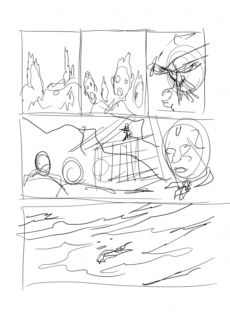
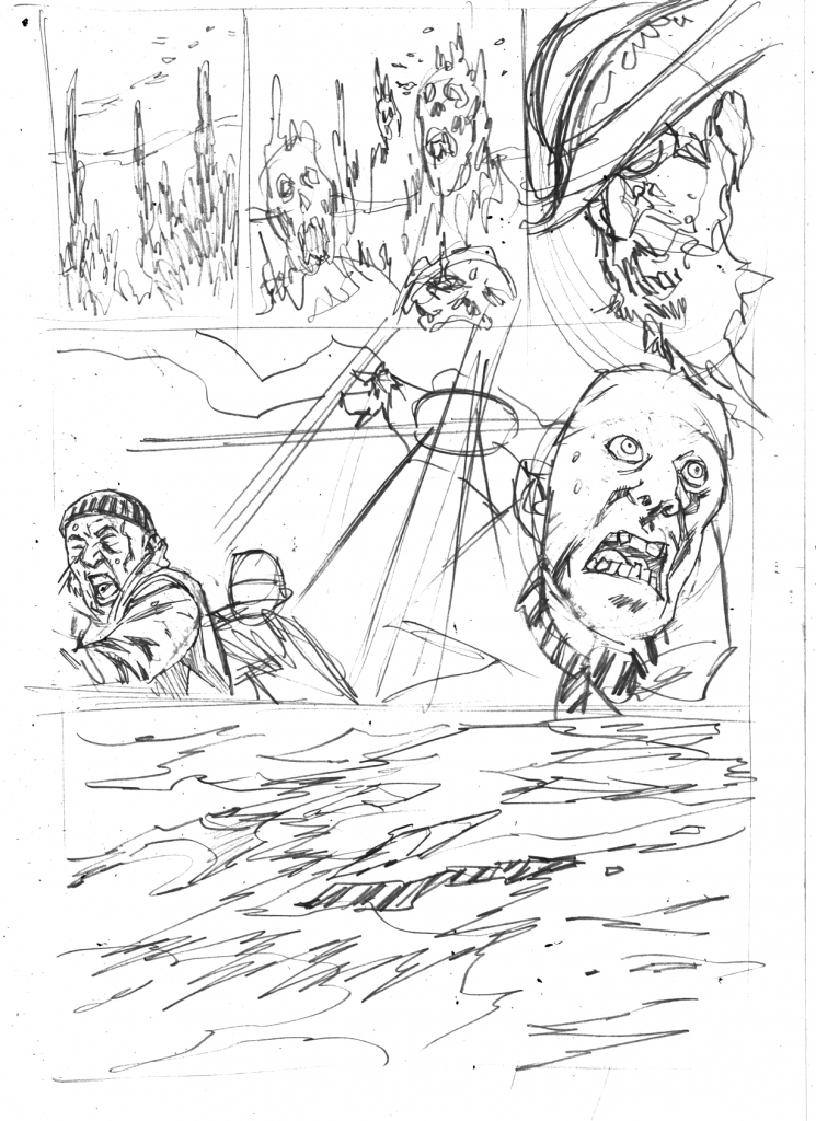
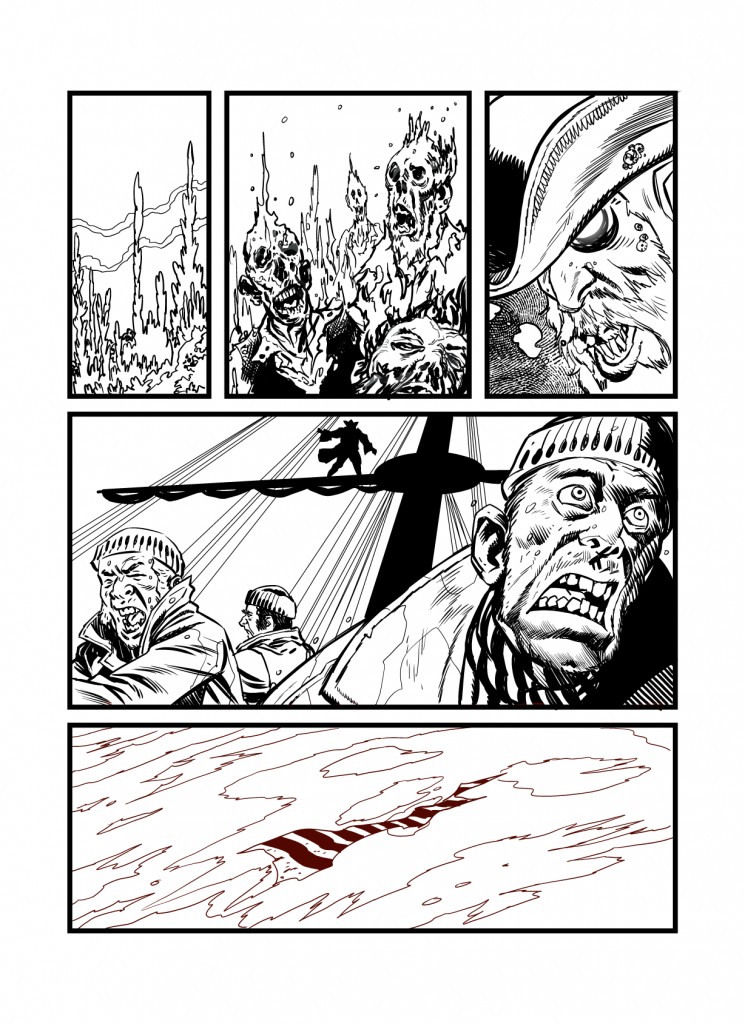
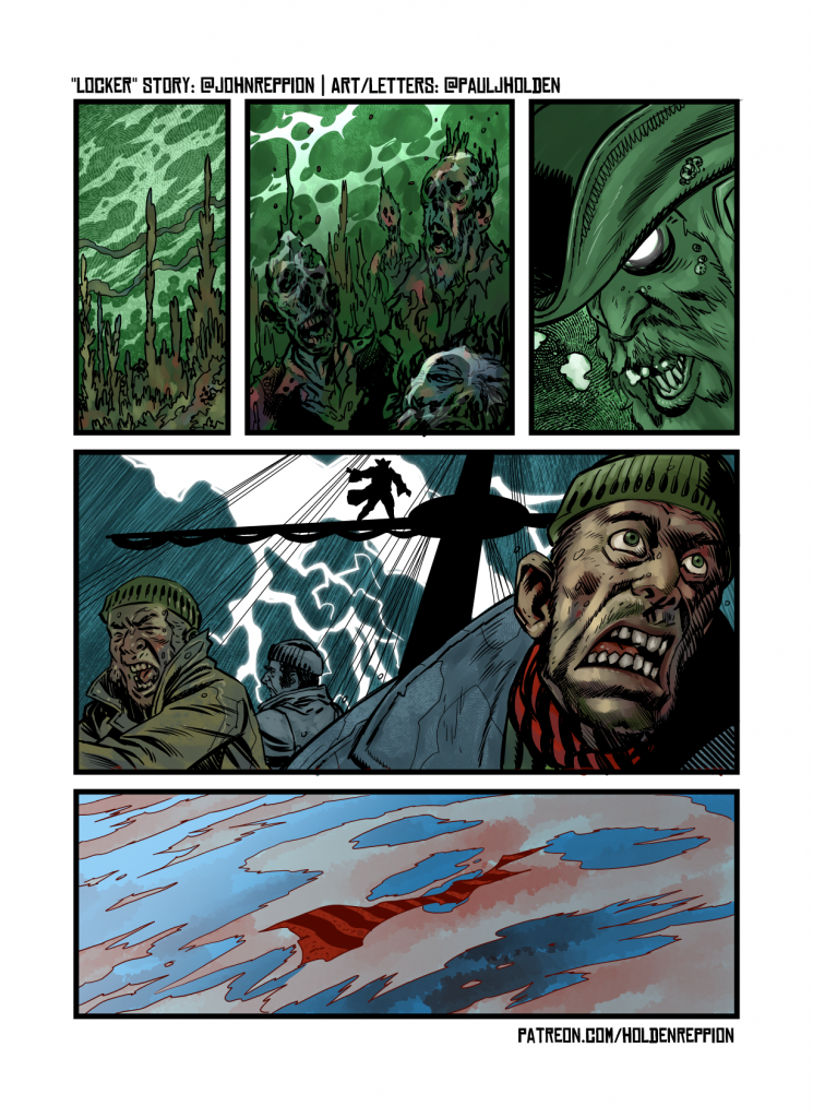
Well, we didn’t really, we work from a list in advance of what the next Folklore Thursday is gonna be. The list is pretty far in advance, and, apparently, this week, changed. So instead of whatever-this-weeks-topic was it became insects. BUT THIS WAS THE FIRST WEEK I WAS ACTUALLY AHEAD! so, poop. Instead you’re getting too Folklore strips. Locker, was my new fav.

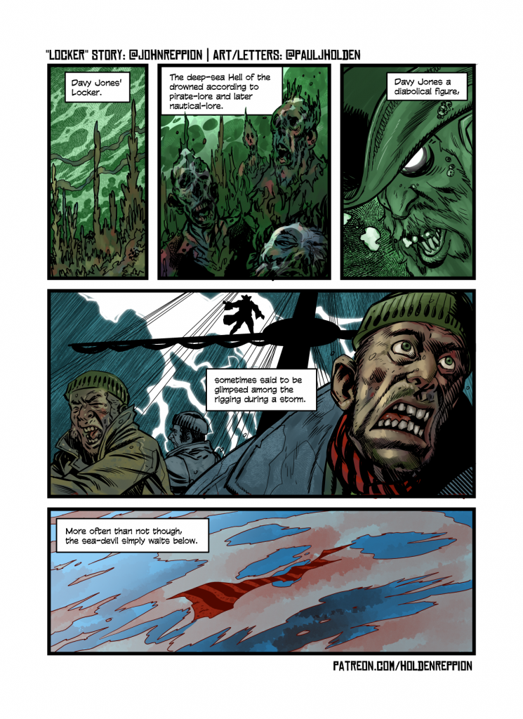
Davy Jones’ Locker. The deep-sea Hell of the drowned, according to pirate-lore and later nautical-lore. Davy Jones a diabolical figure, sometimes said to be glimpsed among the rigging during a storm. More often than not though, the sea-devil simply waits below.

John Reppion via Twitter

I love stuff like this, instantly I could see it all – deep-sear Hell of the drowned. Class! Trying to get something of a narrative in there – the sailer with the red scarf, drowned in the waters. And shifting to a symbolic skull in the water, was fun in the last panel.

I enjoy drawing gruesome faces, so that much is fun for me.

Uniform

I cobbled my version of dredd together over 15 or so years of lifting and removing the bits of his uniform I liked and didn’t like.

The Stallone movie (*spit*) added a couple of things to my Dredd armour – notably a neat tidy collar and tiny little judicial badges (which I only give to fairly senior judges) and a lip or rim around the red part of the helmet…(and my Dredd helmet probably owes more to Steve Dillon than anyone)

(er.. collar badge missing in this picture).

I’m still working on how my eagle looks, but, for the most part it works like this…


Made up of two parts, the lower/inner part acts as the support for the arm, and the eagle – and then the eagle pivots/rests on top of it. Frequently colourists will colour both the same, but my preference is for the inner part to be a dark blue (darker than the uniform even)

I’m still playing with the gloves, but I tend to favour this style (Jock’s design is so strong that even for the brief window he drew Dredd some of his improvements to Dredd’s uniform rippled down through the years)

I imagine they’re velcro fastners. I’ve no idea what the hell they’d keep in those glove pockets -I mean two per glove is a silly size – maybe some bullets?

Belt pouches are fairly classic standard, button with a central ribbing…


Which I think are largely McMahon design.

I don’t think there’s much remarkable about my elbow or knee pads or boots – it’s all big chunky shapes, that look like they’ve been battered about – that’s my preference.

On last thing, and the reason for the blog post… I think – though I may be wrong – I just invented a new way to do one part of the uniform that.. well.. I’ve never been happy about.

The respirator – I’ve seen this done where the badge slides down and covers the mouth and where the entire bulged part where the badge is attached comes down. Which seems marginally more likely (while explaining why it has that bulge)

My new innovation… ta da! is to add pop out fins – now these pop out either side of the respirator when activated, and form a vacum seal around the face (and in fact, possibly they inflate a little – and may – if animated – look like they’re breathing with you).

It looks like this:

(NOT ACTUALLY Judge Dredd… this is another Judge)

I doubt anyone else will ever steal them from me, but even so, I’m happy knowing I adding something totally new to Dredd.