Serves you right

For many years I ran a wordpress blog off a server on phpwebhosting, I started it so long ago that I don’t think there were that many options for self hosted wordpress blogs.

It was always a little slow, but inexpensive with unlimited storage. And it was dirt cheap since – at the time, the dollar to sterling exchange rate was well in my favour.

But times change.

Last year or so I moved over to wordpress. I didn’t really need a php server, I didn’t need the ability to add new websites, I didn’t need infinite storage, but I did want speed and to not have any hassle at all (not that there was much, but even looking after a wordpress blog behind the scenes was more hassle than it’s worth, sometimes)

But… it was more expensive, and, ultimately, was too restrictive. So I went crawling back to phpwebhosting. It felt like a safer option.

But it was still laggy, still a little prone to breaking (for me) and the final straw was, I think, I somehow got flagged in their servers firewall so I couldn’t even access my own site from home (it would work via my iphone – which was on 3g and had a different IP).

So I gave up and started the move to a new server. Thanks to Ben at https://www.stratagem.host who transferred my old wordpress over and sorted me out, I’m back up and running on a faster server at a cheaper price.

Anyway, that’s all very dull for you, but super interesting for me, and hopefully will make adding updates to the blog that much easier.

-pj

Folklore Thursday: Boudicca

Oh man, let’s start with the Tweet. I admit, on first read of this, I got very excited, I knew EXACTLY what I was gonna do. Which sounds great, but it’s inevitably crushingly disappointing as your abilities fail to meet your ambitions (and even worse when the failing is one of laziness more than anything)

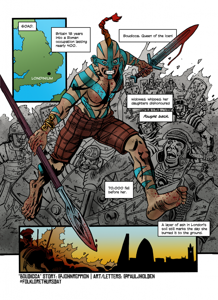
60AD. Britain 18 years into a Roman occupation lasting nearly 400. Boudicca, Queen of the Iceni – widowed, whipped, her daughters dishonoured – fought back. 70,000 fell before her. A layer of ash in London’s soil still marks the day she burned it to the ground. #FolkloreThursday

John Reppion

Straight off the bat, I knew we’d see Britain (grabbed here from an internet search of Roman Britain, just used as a placeholder graphic for inking over), then a single strong image of Boudicca killing thousands of romans (ambition) because of the nature of these things you don’t get too bogged down in realism, it’ll slow you down (if she was in the midst of the murderous revenge rampage, you’d probably not even see her at any angle, buried as she would be by roman bodies). So her leaping over a bunch of shields to get to the next tranche. Ideally I’d’ve drawn literally thousands, but (abilities) couldn’t (lazy) do (time) it.

Sent John pencils cus I actually thought this would be a winner of a strip and I wanted that early Dopamine hit of the writer seeing it and going “Awesome”

Pencils

The last panel would be a transition from the battle to modern day london, I thought that would be suitably poetic. The caption in the pencils was, though, destroying the transition – so I ended up moving it for colour.

Boudicca I drew as an older woman out for horrific revenge, coated in Blue Woad, unfettered by clothing (apart from some trousers – I mean my thinking was she would start fully clothed and shed it as the battle continues over days, untroubled by modesty)

Strongly muscular, and I tied the hair into a single braid – there is a historical description of Boedicca by Dio (not Ronnie James)

“In stature she was very tall, in appearance most terrifying, in the glance of her eye most fierce, and her voice was harsh; a great mass of the tawniest hair fell to her hips; around her neck was a large golden necklace; and she wore a tunic of divers colours over which a thick mantle was fastened with a brooch. This was her invariable attire …” 

Dio, Roman History (LXII.1-2)

I’m willing to bet money he never set eyes on her (I mean, given she is reckoned to have died around 60/61AD and he wasn’t born until c155Ad, it’s a safe bet).

That said, the way these things work (and the way they HAVE to work to make them viable) is John sends me a tweet (which is always smart, well researched and based on extant folklore myths or legends) and I use that as a basis for an inspiration that I do WITHOUT RECOURSE TO RESEARCH. I literally don’t have time to do that. Plus, it’s more fun.

Now, having read the description, I’d’ve probably kept the single mohawk braid, but made it a lot longer (down to her hips) and definitely given her a gold torc around her neck. But, that aside, it’s been interesting watching the reaction to the strip (there’s been some negative reaction which seems to come from certain people who reckon I’ve drawn her as a strong feminist and “ugly” – though they don’t seem to give two hoots about the diabolical liberties I’ve taken with the roman uniforms, so I’m choosing to ignore them)

Anyway, here’s the final, hope you like it!

And, finally, John wrote a really interesting article on Boedicca and it’s worth a read here.

Folklore Thursday: Labyrinth

Ok, I admit, this one got shorter shrift than some of the others. Totally on me, John gave me plenty of time (and a great bit of inspiration)

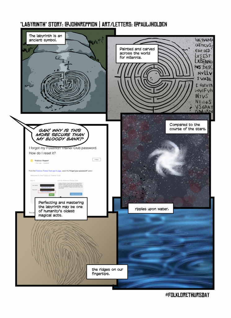
The labyrinth is an ancient symbol. Painted and carved across the world for millennia. Compared to the course of the stars, ripples upon water, the ridges on our fingertips. Perfecting and mastering the labyrinth may be one of humanity’s oldest magical acts. #FolkloreThursday

John Reppion

Time was short, on first read, I knew I wanted to play with a spiral shape – setting the panels in such a way that you’d have to read it in a spiral. I *think* it works, but not 100% sure. And then the final panel – totally on me – I thought it would be a funny undercutting of the building seriousness of the strip (and the dialogue here is mine rather than John’s).

Now, my original plan was to have John walk through a labyrinth as he talked you through of all these things and ending with him facing something? Unsure what.

But I didn’t have the time, so, instead, it was large images. Which meant grabbing stuff from wikipedia. It looked like this:

Images from wikipedia

I did toy with expanding the images out to make our first photo comic, but figured I should put some effort in.

Next week’s will be better.

(Oh, and have you ever tried to reset a pokemon trainer club password? INSANE)

Folklore Thursday: Lindwurm

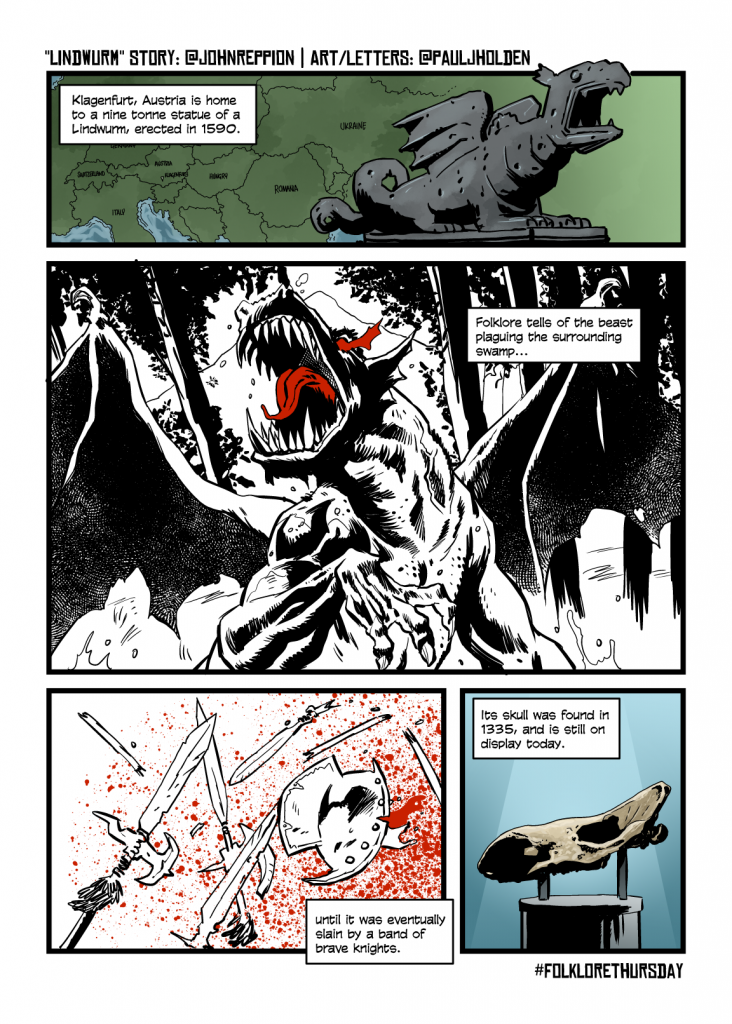
Klagenfurt, Austria is home to a nine tonne statue of a Lindwurm, erected in 1590. Folklore tells of the beast plaguing the surrounding swamp, until it was eventually slain by a band of brave knights. Its skull was found in 1335, and is still on display today. #FolkloreThursday

John Reppion via Twitter

Well, this one came down to the wire. And, as a result, it’s the first one that’s been drawn digitally. Let’s talk you through it.

When I first read the tweet, I thought it would be fun to build up to the big dragon picture, have lots of Knights huffing and puffing and running towards it, lots of panels – a twenty panel page.

Then, I forgot about it and realised I needed to draw this just a few hours before midnight and so that all went out the window.

Luckily other options presented themselves. I took the text, chopped it up and popped it on a digital page – lettering before art. That gave me the structure and some notion of how I’d draw it. So I blarped out this super fast sketch that is, I suspect, utterly meaningless to anyone else…

Hit the drawing board to pencil it traditionally (still a more enjoyable experience than digital pencils) and … I think you can see the shape of those god awful scribbles above coalesced into what I had in mind (on panel 2 I dropped the idea of seeing lots of nights, because, frankly, I didn’t have time)

Notably Panel 1 the map I knew I’d basically find the location on google maps and redraw it, so that was blank, and the last panel, since it’s a real thing, I wanted to get the skull right – though I couldn’t find a decent picture of it, so figured it’d be alright on the night (which er… was the same night, I just mean it’d come together in the inking)

I wanted the inking to be be… richer? More line-y than previous pages. Wasn’t even sure I knew what I meant, but I wanted a different texture for the inks of the dragon. Woodcut.

Of course, I failed.

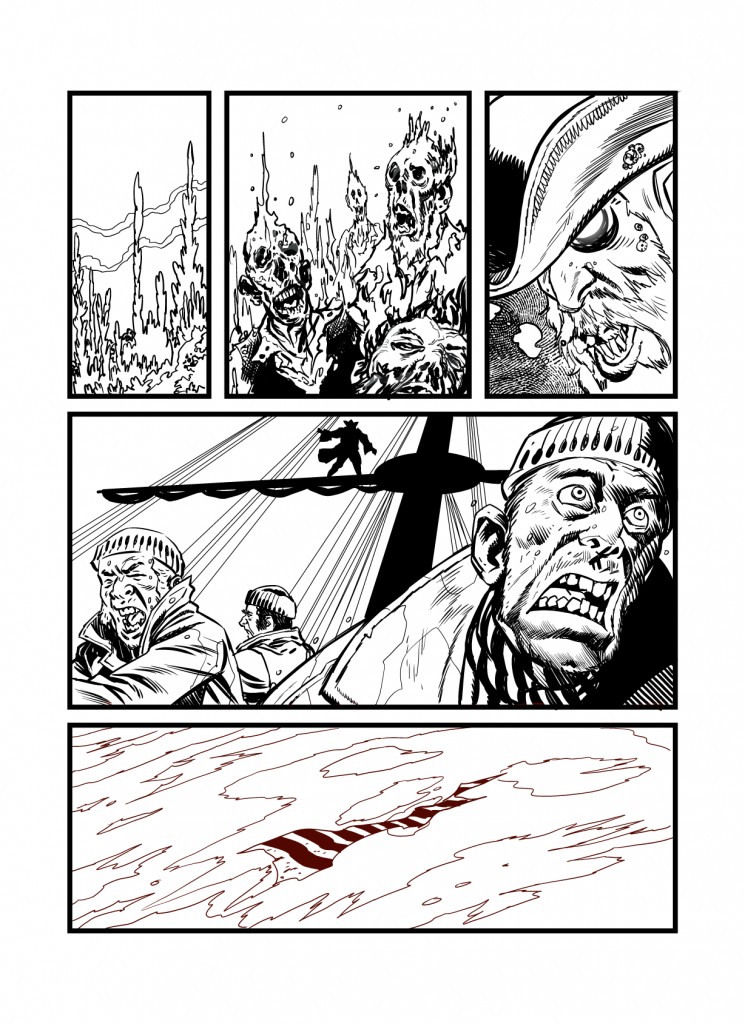
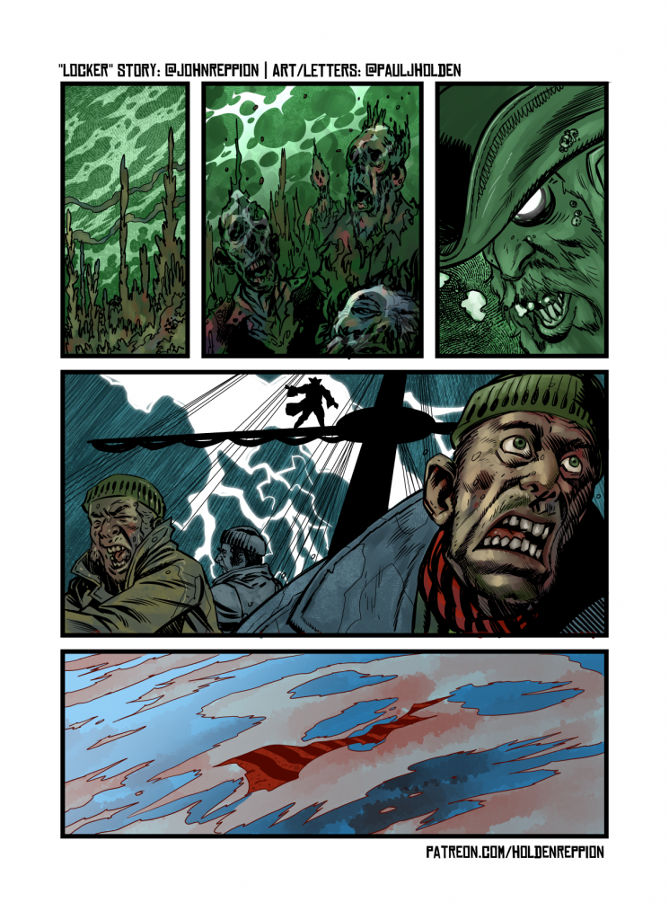
I’ll show the whole inks here, but notably, I inked panel 1 then coloured it, before moving on to the rest of the inks – I decided to keep panel 2 and 3 as a flashback / b&w but it didn’t want it to just look like I was being lazy – so – AHAH! a red spot colour would work really well.

Googled up some “medievil knights austria” to get some notion of the weaponry that would be suitable (though I wanted pikes) and here we are:

And, finally, the coloured art without lettering (for completeness sake)

Oh, John has written a fair amount of follow up on the origins of the Lindwurm in twitter (and if you’re curious, the skull they found was of a Wooly rhino). So go here to read all about the monster…

Savage Dragon

Out this Wednesday is issue 245 of Savage Dragon, Erik Larson’s impressively long running superhero strip.

A while ago (actually quite a while ago) during a bit of a lull in work, I put it out there that if anyone needed a backup strip in an Image comic I’d be happy to do it. And Erik got in touch and asked if I’d like to do a Savage Dragon strip. And ho boy would I!

This is the first time I’ve ever worked “marvel” style, and it was a lot of fun. (And I wouldn’t mind doing more of that kind of work).

Lovely colouring and some great, great lettering rounded everything off, and if you pick up the comic, I hope you’ll like my small contribution…

Image
Image

And here’s some behind the scenes sketches…

I drew this first page a few times…

This next page has Erik’s overdraw, since I was pretty off-model…

Anyway, hope you like it!

Studio Tour

I’ve had a room to work in since around 1997, when my wife (then GF) and I moved into our three bedroom flat. At that time, I had a massive room that I used to work in – it was so big literally half the room was just … empty space. The other room ended up as a storage room.

Then we had one kid, and then another. And so, I still have a room for working in, but now it’s tiny.

The thing is, up until a few years ago, I used to refer to this room as “My drawing room” which of course, needed more explaining – “no, not the nice room behind the sitting room, it’s the room I draw in.”

Anyway, now it’s a studio, and it has been for a few years. So anyway, thought I’d give you a tour since it’s about 80% more tidy than usual…

Ok, this is the exciting sight that you’ll see on your way in.

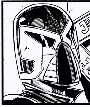
In the distance there you can see my Mike McMahon print of Dredd. The folders (bit hard to see here) on the floor in front of you contain a bunch of original art, I tried to move away from just shoving art into drawers and keep them in folders, but they all ended up on top of each other. Ultimately I make too much art. Whatcha gonna do…

What’s on the wall, Paul.

The white board keeps me on track for projects (or I pretend it does, really I need to figure out a perfect system and this isn’t it)

Mounted on the wall are my Chris Sprouse page and a Cully Hamner, gorgeous clean superhero art. Cully’s page is amazingly 1:1 to print. I dream of that sort of precision.

(And there’s a page of mine rather rubbishly just sitting there)

I oughta get more stuff on the wall, really.

I want to believe…

The UFO in the top left is a left-over from when this room was my eldest son’s nursery… about … uhm… 14 years ago (yikes!)

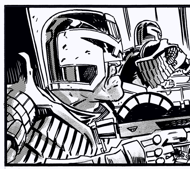
The Judge Dredd page here is by my old Pal, John McCrea – I want all my friends to give me original art all the time, but this was the first time I’ve ever asked someone to just .. GIVE ME THAT PAGE. And it’s because, well, one it’s by John so that means a great deal (and it means more that it was a gift, albeit one I demanded…) but it has Justice-1 on it, which was Dredd’s spaceship in the Judge Child Saga, and an abiding memory I have is building that space ship out of computer Punch Card, with my Uncle Paul when I was about 10.

Shelves stacked with an assortment of nonsense – the black shelves at top where gonna be home to a small, but cool, Batman animated series collection of toys. But they now sit, unloved, in that big white box. The nude model is turned to save my kid’s modesty who used to take great delight in pretend offence when they saw his little plastic todger.

Other notable cool beans: Bike from Akira, Dredd statue based on the McMahon dredd (in greyscale) the Chris Samnee Daredevil original art book (he draws very big…) and a collection of Dredd reprints that, I think, contain my work.

Back to the drawing board

The drawing board, cleared up for working traditionally, after a few months of digital work it’s nice to sit back down and remember how much fun drawing on paper can be.

Back to the digital drawing board

There’s not much organisational thought in my shelving process, but these two shelves have SOME specifics about them. At top the 2000AD collection. Big books o’ 2000Ad stuff. (Though not always) then below it shop talk, how to draw books. I’ve read a fraction of them. It is a constant reminder of my inadequacies. (I spelt that word right first time, and it somehow alleviate those feelings of inadequacy!)

There are two printers here: a brother dcp6690CW – an A3 scanner/colour printer which is essential to how I work – I can scan A3 comic art and blueline print pencils for inking. And beside it, a Brother Laser Printer HL2350-DW which is a nice little b&w laser, that can print double sided. I use this for scripts (and I intend to use it for a little bit of self publishing. Maybe)

27″ Wacom Cintiq – my primary digital drawing tool. All hooked up to a mac mini (which is sat on a bunch of boxes of original comic art, that I don’t ever expect to be opened again until I die and my great great grand kids try and figure out what kind of person I was. It won’t help them)

Also Amazon Echo, which I love. Much better audio than the mac mini’s rubbish little internal speakers (though they’re better than my last PC which didn’t have any speakers at all)

Wall of Shame

This corner is superbly unorganised. Just an assortment of stuff. Ugh. I should tidy it.

And finally…

That corner is such a hot mess.

Oh yeah, up in the top right – you can just about see — a Batman Animated The Dark knight figure and a Batman Animated The Demon. They both rock, but they’re staying in their display boxes rather than the big white box of doom.

Folklore Thursday: Mushroom

Blame me for the titles. John writes a tweet, I supply a title, it was ever thus (in er.. the five weeks we’ve been doing this).

Fairy Rings are circles of mushrooms often seen in fields and woodlands across Europe. They mark the meeting, and dancing, places of the Fae. If a human steps into one, they may glimpse the Little People. But bewitchment, ill fortune, and even death may follow. #folklorethursday

John Reppion via Twitter

I’ll be honest, I consider this one a failure on my part. (It’s neither modesty, nor fishing for praise, just honest assessment). I wanted it to work so badly. I’ve done some nice watercolour stuff in the past, but never a full strip. I thought if I can quickly pencil it and then water colour over it, it should be nice.

It wasn’t. It was.. at best.. a good start.

Compounding this, sadly, was the fairly barely adequate nature of my scanner. It’s important to know and understand the limits of the tools you use, and my faithful Brother DCP6690 has served me well for over a decade, scanning pencils and inks at A3 size, and printing pencils as bluelines on heavy bristol board (sometimes it spews that out and just refuses to play ball, but that’s ok – it owes me nothing). Unfortunately it’s bloody awful for colour. Scanning colour is a serious art in itself. Even if your scanner scans a true and accurate reflection of the art (which is unlikely as the scanner’s light casts a sickly blue light, which is why blue line printing can be easily dismissed by the scanner – it’s practically invisible in the bluewhite light. ) then you’re faced with whether your computer monitor is set up in a way that can accurately show you those colours on screen. Plus the art software (in this case clip studio) may decide to preview it for print and give it a slightly different hue. It’s all a nightmare.

Part of the remit though, is to do these things quickly, so I don’t really have the luxury of going back and reworking (though in this case, I DID) or fiddling with colours when scanned and I wrestled with it, and I thought – better to put out a heroic failure, than to cowardly revert to type and do it again in b&w with digital colours (also I was too lazy)

And one thing I learned while acting is… nobody knows about mistakes until you tell them. So ignore everything I’ve said here and assume this strip is exactly what I meant it to be.

(No pencils on this one, as it was pencilled and coloured in one go)

Folklore Thursday: Mandrake

You know the drill by now…

John’s original tweet:

The roots of the Mandragora genus of plants are known as Mandrakes. Once prized as magical ingredients they are hallucinogenic, and highly toxic. It was once believed that when uprooted, the Mandrake would scream. Its terrible cry striking dead any who heard it. #folklorethursday

https://twitter.com/johnreppion/status/1159376208292982784

I vaguely remembered seeing a diagram of the Mandrake plant that was, it turned out, from wikipedia. I thought that’d be a fun opening panel. It would feel different from whatever I drew following it.

Panel one I was toying with drawing someone who would prize a magical ingredient, I kept leaning towards a wizard – but everything looked a little goofy (my knowledge bank in my head kept suggesting wizard cliches, and anything that wasn’t a cliche was too hard to “read” as wizard). Then I thought … oh, a druid! quick google of a druid and, you know, bland but workable. Then I remembered a deep buried memory from childhood… GETAFIX!

Hopefully this fun non-authorised use of the old Asterix Druid is ok (is this considered fair use?) if not, it may be an internet only version, and at some point I’ll have to edit him out – boo!

One of the jobs as cartoonist on this strip is to link the words together with some sort of narrative, and sometimes the narrative requires only a single image, but here, moving from prized… to hallucinogenic… to toxic required a number of steps (this is why I get paid the big bucks). I’m always trying to shorten the those steps but this time it was pretty much impossible. I had to get the druid to collect, cook and then sample the mandrake (taking us from ‘prized’ to ‘hallucinogenic’ -dropping the cooking /tasting would’ve let it a little confusing about why he was suddenly hallucinating) then another step to toxic. The line art, on its own was gonna struggle a little to show toxic -I thought one open eye then one winking closed would give a sense of a transition from toxic to death – plus a little skull and crossbones, but colour was gonna be the real way to sell it. A sickly green on the face (if I didn’t have colour I’d probably do it as two panels, or leave it was one – not just as clear a pay off)

And the final mandrake gets short shrift here, I kept thinking of Kate Bush’s Experiment IV (a sound that can kill) and following the shriek around as it kills people, but, ultimately, I’ve one page to play with so I’ve got to pick and choose my moments. I liked the goofy mouth of the mandrake and figured with the captions, it’d be enough.

And that’s your lot! Until next week…

Folklore Thursday: Hawthorne

This week’s folklore topic is Trees and Forests. As ever, the strip was prompted John Reppion’s tweet length story:

In 1990 work on the Limerick to Galway motorway halted. A lone tree stood in its way. The Hawthorne, according to tradition, belonged to the Sidhe (Ireland’s Fairies). Disturbing such sites is forbidden. A curve was added. The road snaking around the Thorn Tree. #folklorethursday

My original plan on this was to do a moody Frank Miller piece, stark black and white and a dash of red. At least that was my plan until I read John’s tweet (quick backroom secret: we know both the topic’s in advance, and John sends me his tweet in advance).

The moment I read the tweet, I KNEW I was gonna go Arthur Rackham on it.

Arthur Rackham (b.1897-d.1939) was a British book illustrator who did a wonderful line in fairies and trees. He’d often morph the shapes of trees into beautifully gnarled figures too. Fantastic artist, I fell in love with when I first saw his work in my late teens – my dad was/is a collector of antiques/ephemera, and had got hold of an Arthur Rackham illustrated edition of Wagner’s Ring Cycle, no internet in those days, so seeing that, and finding books about him, was the only way to find out anything. Nowdays a quick google search will turn up hundreds of drawings. Kids, eh? dunno they’re born.

Felt fairly confident we’d see a large tree right in the centre of the page. So I started from there. Decided to go with a couple of construction guys on panel one, and the idea that the fairies where playing havoc with the traffic cones suggested itself.

Hawthorne, pencils.

Next step after pencils is inking…

Hawthorne inks

I’d toyed with the idea of drawing a map, to show the road snaking around the tree, but it really was a struggle to make that seem interesting, thought it would be more fun to draw a car driving past the tree, with the passenger completely oblivious to the wonders around them (like everyone with kids, you know they’re sitting in the back on their ipads no matter how loudly you shout “LOOK! MOO MOO!” as you pass a cow)

I left a big gap beside car panel, because it felt like it balanced out the composition. I knew I’d put some text there (and I was still toying with a map)

Colouring

Hawthorne: Flats for colouring

Colouring begins with flatting a page. Basically you add a simple flat colour to all the individual elements of a page – these colours won’t generally be final, in fact sometimes you’re better colouring them with entirely random colours. You’ll use the magic wand tool in clip studio or photoshop to pick up the groups – so, for example, I could select JUST the colour bands of the traffic cones by using the magic wand tool.

At this point I was still thinking of colouring this page as naturally as possibly, but two thinks struck me: firstly, I DID want to do something different with this one, three pages is a pattern and I didn’t particularly want to do patterns and secondly, it just felt like any colour would detract from the big tree. So I decided to make the inset panels pure black and white. Which was a little too stark, so I moved them to greyscale. And I quite like the look.

Hawthorne: Final colours and Lettering

This is the first time I’ve messed around with the lettering, but introducing the repetition of The Hawthorne seemed like a more natural way to read the text. (When I’m placing the dialogue I’m reading it aloud, I’ve done some acting so I think I’ve a solid ear for how dialogue can be heard).

If you’re interested, you can read more about the tree here.

One final thing, the original black and white pages are drawn at A4, pencilled on one side, inked on the other and they’re available for sale. You can contact me directly if you’re interested.