Yes, it’s a four blog post kind of day.
I love twitter, but stuff gets buried, and it’s harder to do long form thinking on it.
Anyway, was thinking today (after stumbling across this procedurally generated maps of cities for dungeons and dragons) that it would be cool to do something similiar for comics. Something that could give you a whole bunch of panel layouts generated from a bare minimum of input. You put in the number of panels and it gives you a dozen layouts. You could select one panel and make it an exterior, or another and make it inset, and click you’d get another dozen layouts all keeping that in mind.
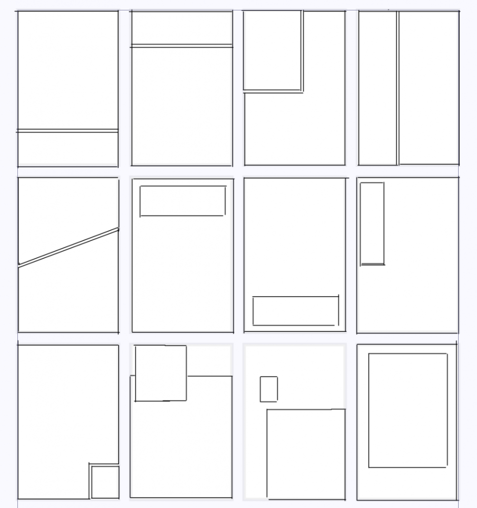
I’ve always been fascinated by the grammar of panel layouts. Let’s take the simplest count of panels: 2.
Here’s a bunch of options:

And that’s before you get into bleeding images off the page, circular panels, batman shaped panels or what’s even in the panels.
And some of these I think work better as first pages, and some work better as last pages (notably, the second panel being smaller, or inset below the midline of the page feels like a full stop on a page).
Three panel layouts explode your options, and it just gets wilder and wilder.
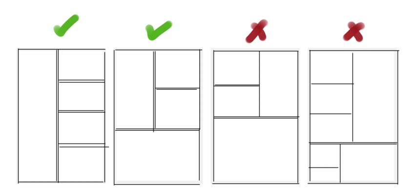
And I like nice readable panel layouts, so there’s some rules I’m a real stickler for, I love stacked panels, but stacking order is important:

Stacking on the right of a large panel is perfectly readable, stacking on the right can be illegible (though clever tricks with lettering/art can make it more readable, but really do yourself a favour and don’t do it!)
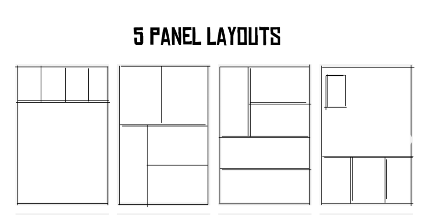
And here, dear reader is some examples of five panel layouts:

I keep meaning to (though never seem to have the time to) go through some of the great works (Dark Knight Returns, Watchmen, er.. probably others) and draw out their panel layouts. I find them fascinating.
(Of course, Hass, of “Strip Panel Naked” has gone in to depth about panel grid layouts and I recommend you go and join his patreon/watch his youtube!)
